30 Backsplash with Cherry Cabinets Ideas That Prove This Trend Is Here to Stay
- Classic White Subway Tile
- Cream Zellige Tile
- Warm Beige Mosaic Tile
- Black Granite Mosaic
- Herringbone Pattern in Neutral Tile
- Glass Tile in Soft Green
- Traditional Travertine Tile
- Vertical Subway Tile Installation
- Warm Gray Porcelain Tile
- Stacked Stone Backsplash
- Cream Subway Tile with Brass Accents
- Moroccan-Inspired Patterned Tile
- Butcher Block Countertops with Simple Tile
- Terracotta Tile Backsplash
- Marble Subway Tile
- Dark Grout with Light Tile
- Handpainted Talavera Tile
- Soft Blue Ceramic Tile
- Large Format Tile for a Seamless Look
- Copper Tile Accents
- Classic Hexagon Tile
- Warm Wood-Look Tile
- Full Height Backsplash in Neutral Tile
- Cottage-Style Beadboard Backsplash
- Warm Taupe Subway Tile
- Fish Scale Tile Pattern
- Two-Tone Tile Backsplash
- Rustic Reclaimed Brick Tile
- Soft Sage Green Tile
- Mixed Material Backsplash
30 Backsplash with Cherry Cabinets Ideas That Prove This Trend Is Here to Stay
Cherry cabinets have this warm, rich glow that a lot of newer cabinet colors just can’t fake. If you’ve got them in your kitchen, you already know they’re not going anywhere anytime soon, no matter what the design blogs say about painting everything white. The trick is finding a backsplash that plays nicely with that reddish-brown tone instead of fighting it. Some pairings make cherry wood look dated, and others make it look like it was planned that way from day one. These 30 ideas cover every style, budget, and vibe so you can find the one that actually fits your kitchen.
Classic White Subway Tile
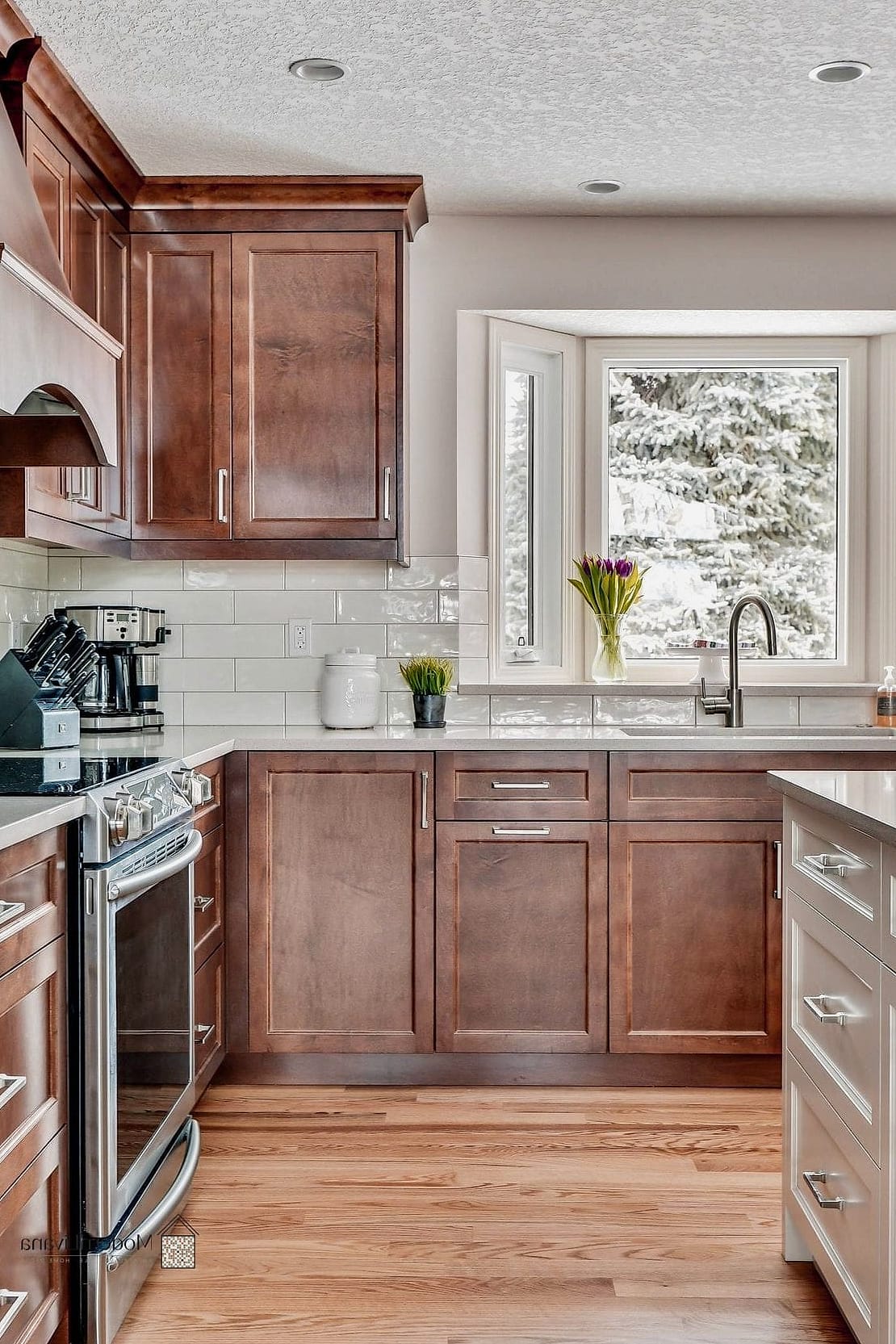
This one is a no-brainer for a reason. White subway tile against cherry cabinets creates a clean contrast that keeps the kitchen from feeling too heavy or too dark. It works in kitchens of any size, but it’s especially helpful in smaller ones where cherry cabinets can start to feel closed-in. Go with a bright white grout for a crisp look, or a warm gray grout if you want something a little softer. It’s also one of the more budget-friendly tile options out there, which never hurts.
Cream Zellige Tile

Zellige tile has that handmade, slightly imperfect look that pairs beautifully with the natural variation in cherry wood grain. The soft cream tone doesn’t compete with the cabinets, it just kind of complements them. This is a great pick if your kitchen already leans traditional or Mediterranean and you want to add texture without adding a ton of color. It’s pricier than standard ceramic tile, but even a small accent area can make a big visual impact.
Warm Beige Mosaic Tile
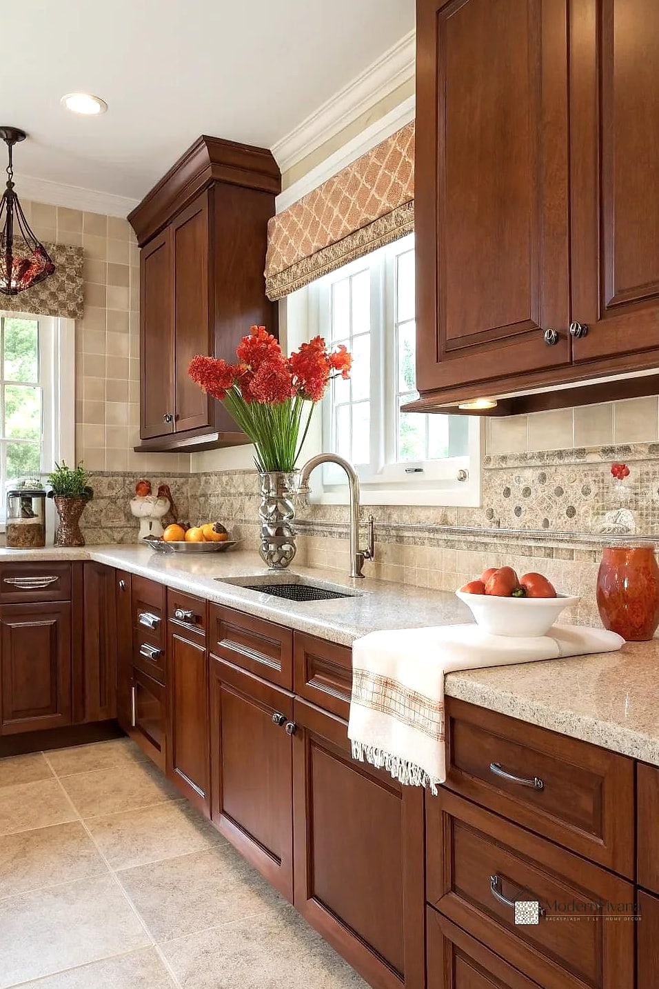
Mosaic tile in warm beige or tan tones bridges the gap between the reddish undertones in cherry cabinets and cooler countertop materials like quartz or granite. The small tile pieces also add a bit of texture that keeps a plain backsplash from feeling flat. This works especially well behind a stove where you want a focal point without going too bold. Cleaning grout lines on mosaic can be a little more work, so a sealed grout is worth the extra step.
Black Granite Mosaic
If your cherry cabinets have deep, almost mahogany undertones, a black granite mosaic backsplash can pull those tones out beautifully. It reads as sophisticated rather than dark, especially with good lighting overhead. This pairing tends to show up in more traditional or transitional kitchens. Granite is naturally durable and holds up well to heat and splashes, which makes it a practical choice near the cooktop.
Herringbone Pattern in Neutral Tile
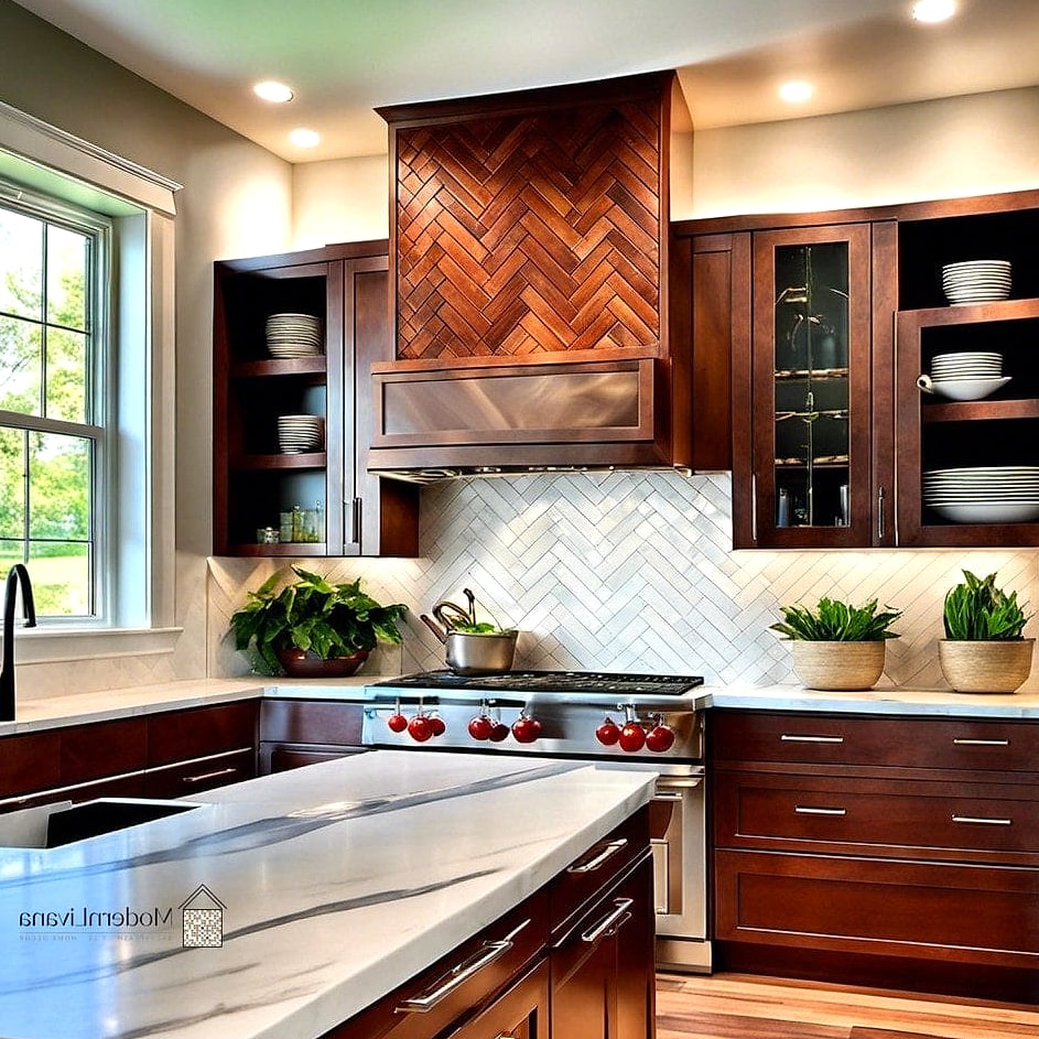
A herringbone layout adds movement and visual interest, which is helpful when cherry cabinets are already doing a lot of the visual heavy lifting. Sticking with a neutral tile color, like soft white or light gray, keeps the pattern from overwhelming the space. This is a nice option if you want your backsplash to feel a little more custom without going overboard on color. Installation is slightly trickier than a straight-lay pattern, so it’s worth hiring a pro if you’re not confident with tile work.
Glass Tile in Soft Green
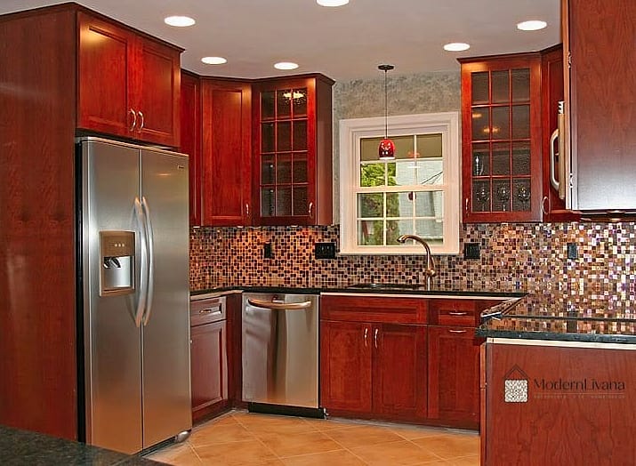
Soft green glass tile brings a little bit of unexpected color into a cherry cabinet kitchen, and it works surprisingly well. Green has enough warmth to feel connected to the wood tones but enough coolness to balance them out. This pairing tends to show up in kitchens with a more updated, slightly eclectic feel. Glass tile is also easy to wipe down, which is a nice bonus for anyone who cooks often.
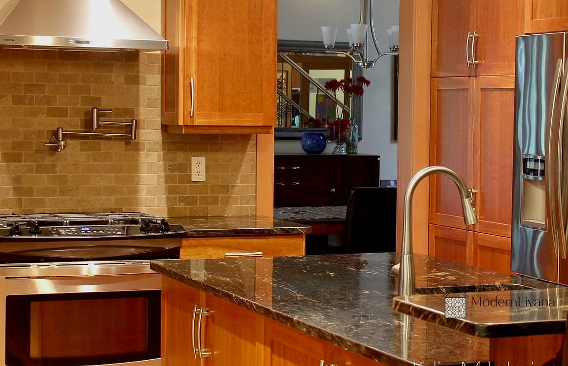
Traditional Travertine Tile

Travertine has that soft, earthy quality that naturally complements cherry wood without trying too hard. It’s a classic pairing you’ll see in a lot of Tuscan-inspired and traditional kitchens. The stone’s natural pitting and variation add texture and keep the backsplash from looking too uniform or plain. Travertine does need periodic sealing to prevent staining, so it’s a bit more maintenance than tile, but many homeowners feel the look is worth it.
Vertical Subway Tile Installation

Turning standard subway tile on its side instantly makes a backsplash feel more current, even in a kitchen with more traditional cherry cabinets. The vertical lines draw the eye upward, which can make lower ceilings feel a little taller. This is an easy update if you’re already committed to subway tile but want something that doesn’t look like everyone else’s kitchen. It’s also a fairly DIY-friendly project if you’ve done tile work before.
Warm Gray Porcelain Tile
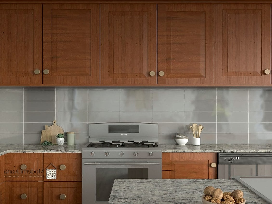
Porcelain tile in a warm gray tone is one of the more practical choices for busy kitchens. It’s durable, stain-resistant, and easy to clean, which matters a lot if you’re cooking daily. The warm undertone keeps it from feeling cold next to cherry cabinets, striking a nice middle ground between neutral and cozy. This is a solid pick for families who want something low-maintenance but still stylish.
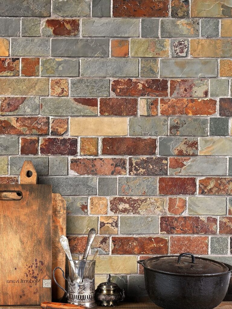
Stacked Stone Backsplash
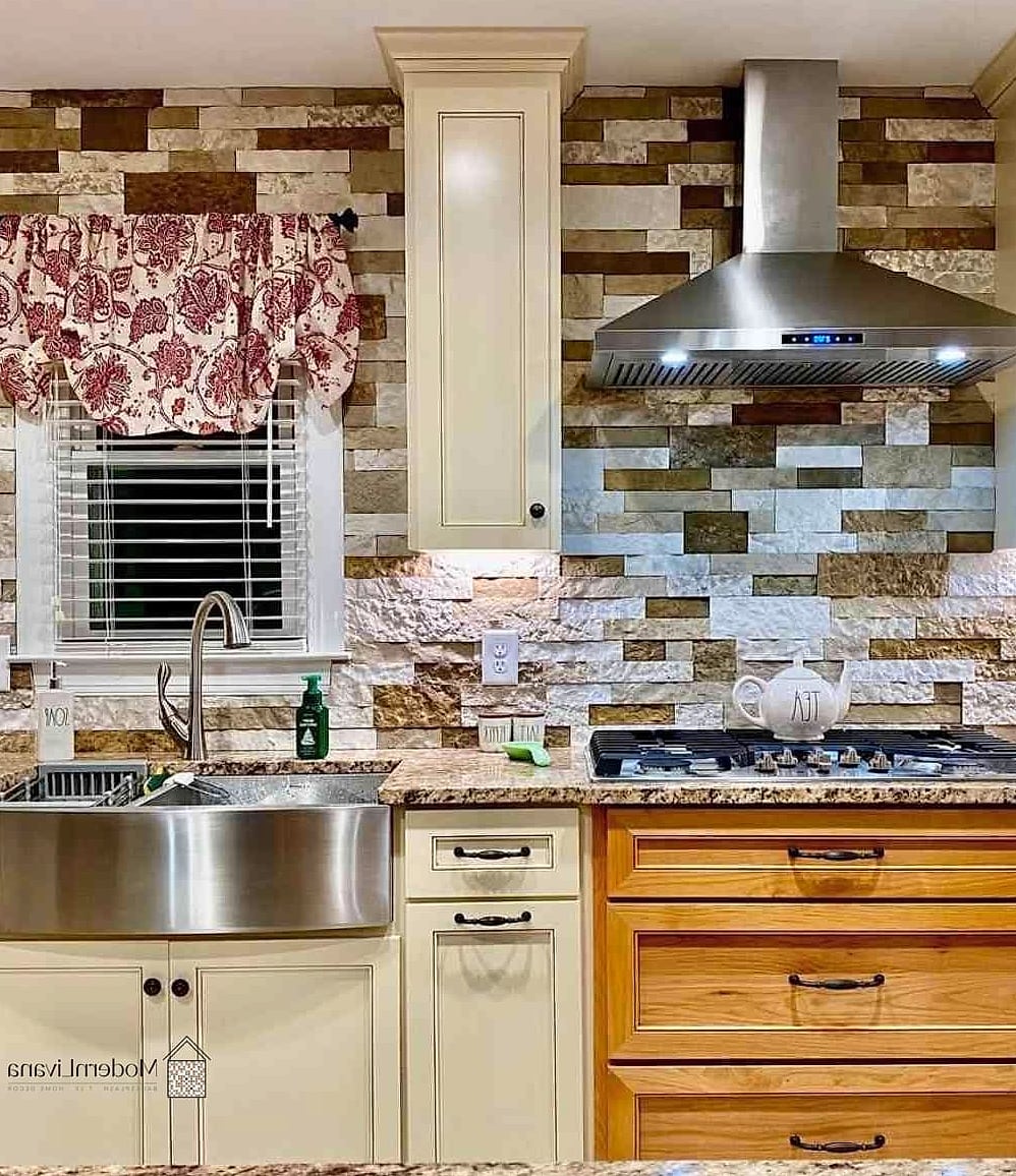
Stacked stone brings a rustic, cabin-like feel that works surprisingly well with cherry cabinets in farmhouse or lodge-style kitchens. The rough texture and earthy colors echo the natural warmth of the wood. This tends to work best as a focal point behind the range rather than wrapping the entire kitchen, since it can feel like a lot in large doses. It’s a heavier material, so proper installation and support matter here.
Cream Subway Tile with Brass Accents
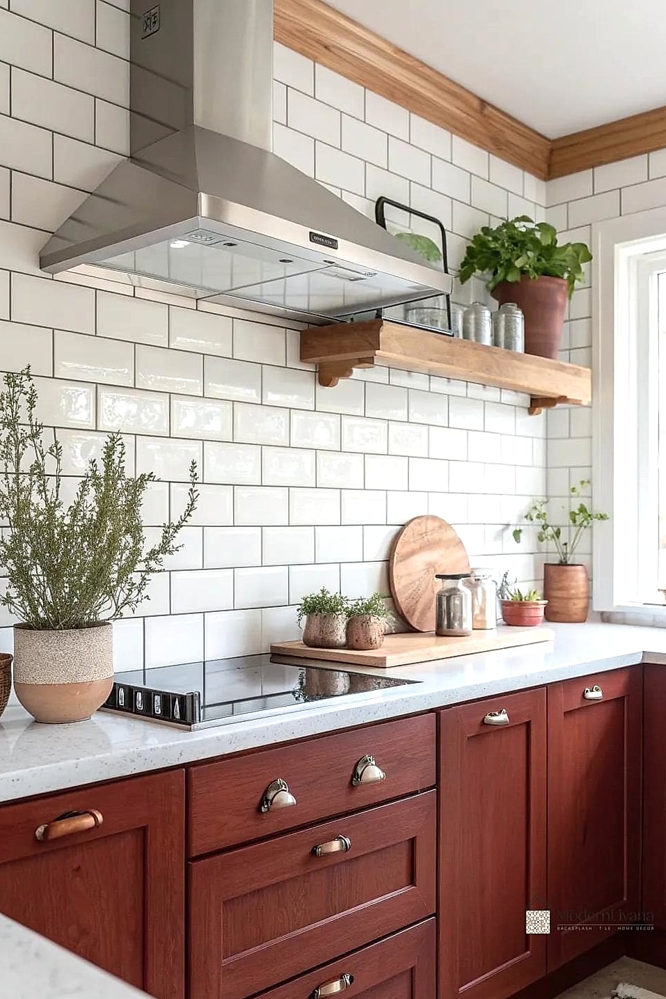
Swapping bright white for a cream-toned subway tile softens the contrast against cherry cabinets and feels a touch more elevated. Pair it with brushed brass hardware and fixtures, and the whole kitchen starts to feel intentional rather than thrown together. This combination has been showing up a lot in updated traditional kitchens lately. It’s a simple swap if you’re already leaning toward subway tile but want something with a little more personality.
Moroccan-Inspired Patterned Tile
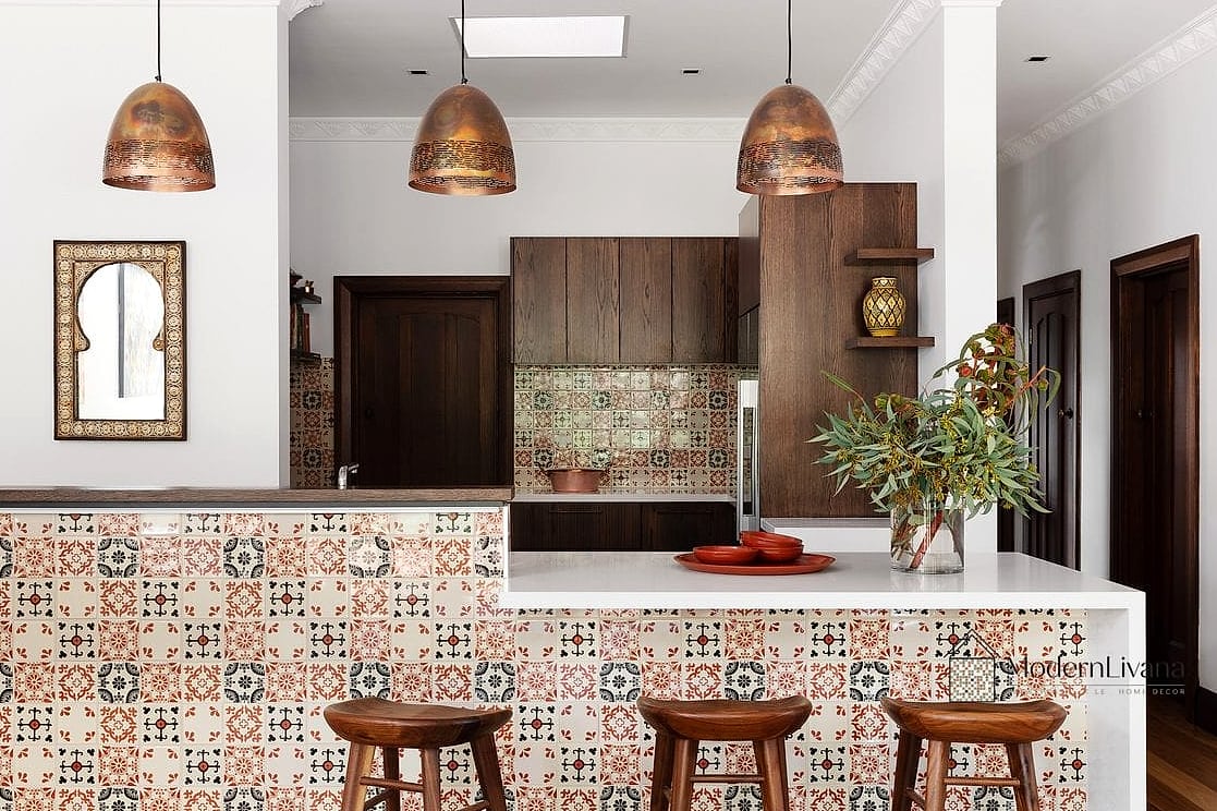
Patterned tile with Moroccan-style motifs adds personality and color without requiring a full kitchen overhaul. Blues, terracottas, and creams in the pattern tend to play well with cherry’s warm undertones. This is a great option for anyone who wants their kitchen to feel a little more unique and less like a catalog page. Keep the pattern to the backsplash only and let simpler countertops balance it out.
Butcher Block Countertops with Simple Tile
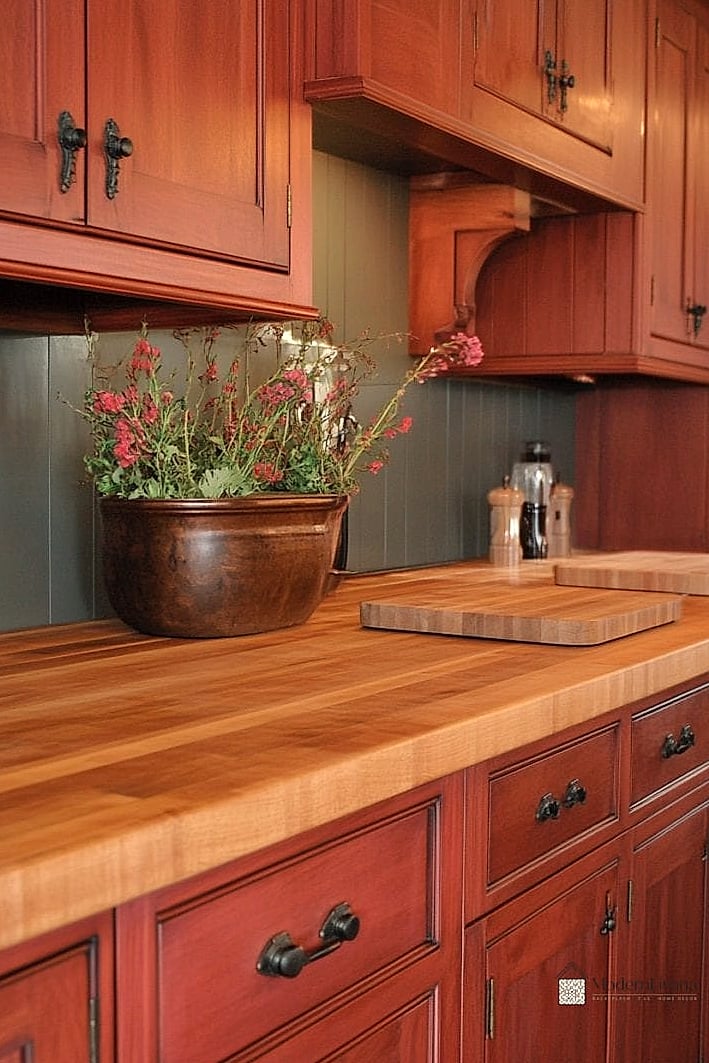
While not technically the backsplash itself, pairing a simple tile backsplash with butcher block countertops changes how the whole kitchen reads next to cherry cabinets. The wood tones don’t have to match exactly to look cohesive, they just need to share similar warmth. A plain white or cream tile keeps the focus on the wood tones working together. This combo also tends to be more budget-friendly than stone countertops.
Terracotta Tile Backsplash
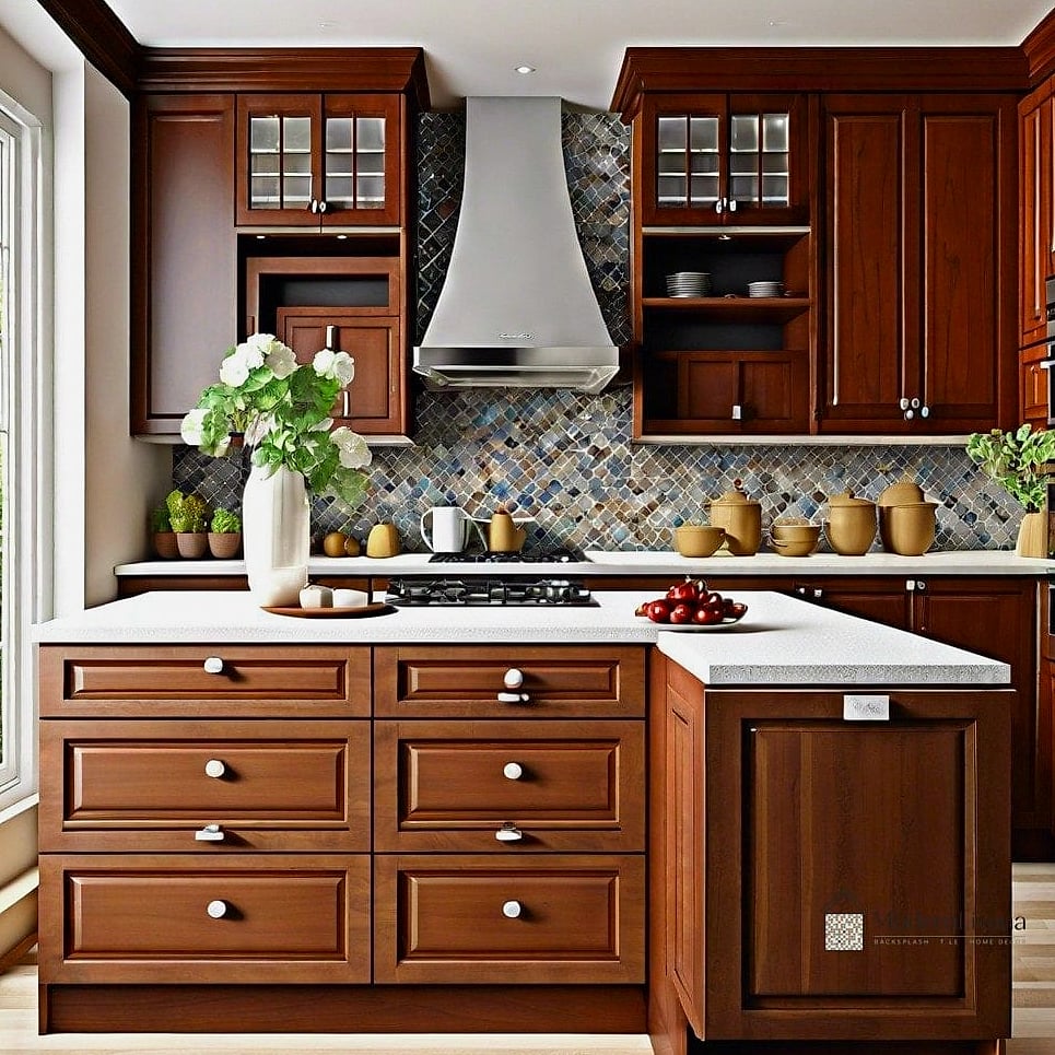
Terracotta tile brings out the reddish undertones in cherry cabinets in a way that feels intentional rather than matchy. It has an earthy, sun-baked quality that works well in kitchens with a Southwestern or Mediterranean lean. This isn’t the most common choice, which is exactly why it stands out. Terracotta does require sealing to prevent staining, so factor that into your maintenance routine.
Marble Subway Tile
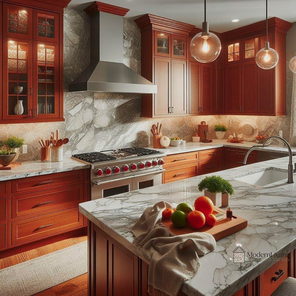
Swapping ceramic subway tile for marble instantly bumps up the elegance factor. The subtle veining in the marble adds visual interest that flat ceramic can’t quite match. This pairing tends to show up in kitchens aiming for a slightly more upscale, transitional feel. Marble is more porous than porcelain, so a good sealant and prompt cleanup of spills will help it last.
Dark Grout with Light Tile
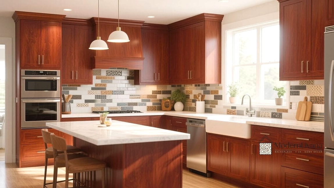
Sometimes the tile itself isn’t what changes the look, it’s the grout. Pairing a light tile with a dark charcoal or black grout creates definition and a bit of drama against cherry cabinets. This works especially well with subway tile or small square tile where the grid pattern becomes part of the design. Dark grout also tends to hide daily grime better than bright white grout, which is a practical perk in a busy kitchen.
Handpainted Talavera Tile

Handpainted Talavera tile brings bold color and pattern into the kitchen, and the warmth in cherry cabinets actually helps ground all that vibrancy. This is a great choice for anyone who wants their kitchen to feel a little more artistic and personal. It works best as an accent strip or focal area rather than covering the whole backsplash. Because each tile is handmade, expect some natural variation, which is part of the charm.
Soft Blue Ceramic Tile
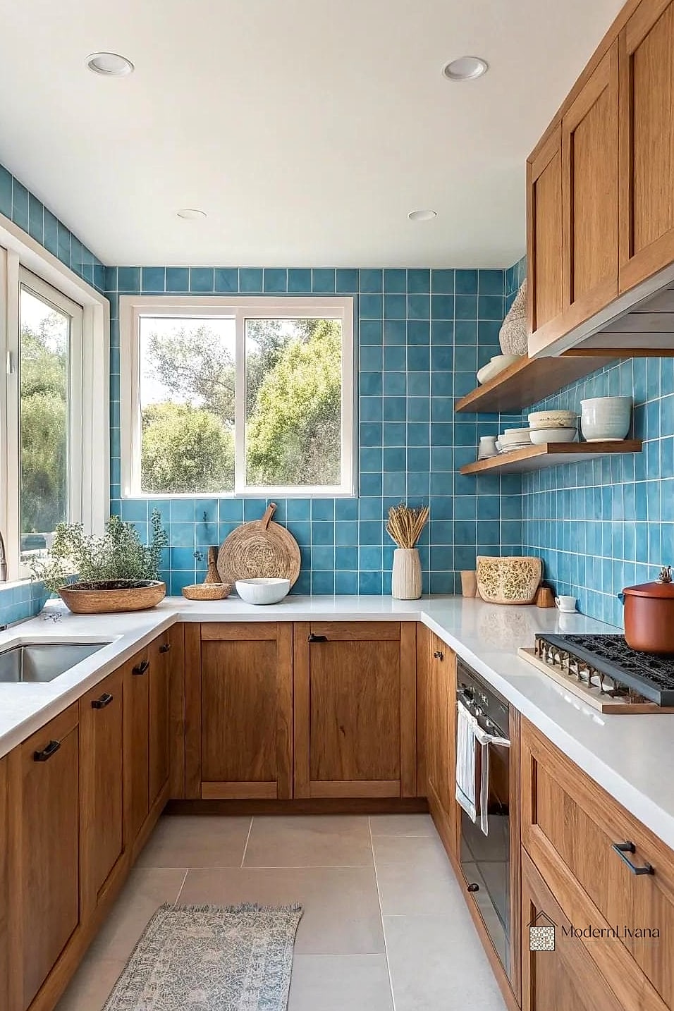
Soft blue tile creates a nice complementary contrast against the warm reds and browns in cherry wood. It’s a color pairing that feels fresh without being trendy in a way that’ll date quickly. This works well in kitchens that get a lot of natural light, since the blue can read a bit cooler in darker spaces. Ceramic tile in this shade is widely available and generally budget-friendly.
Large Format Tile for a Seamless Look
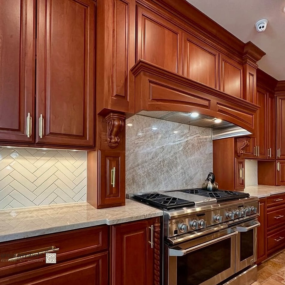
Large format tile means fewer grout lines, which creates a cleaner, more modern backsplash even in a kitchen with traditional cherry cabinets. This is a good option if you want the wood to stay the star of the show without a busy tile pattern competing for attention. Fewer grout lines also mean less scrubbing come cleaning day. It’s a nice middle ground between classic and contemporary.
Copper Tile Accents

Copper tile has a warm metallic shine that pulls beautifully from the reddish tones in cherry cabinets. Used as a full backsplash or just an accent strip, it adds richness without adding a lot of visual noise. This tends to work well in kitchens with warm metal fixtures like oil-rubbed bronze or aged brass. Copper can patina over time, which some homeowners love and others prefer to seal against.
Classic Hexagon Tile
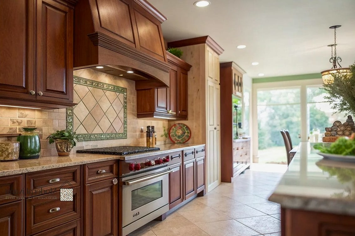
Hexagon tile in a small scale adds subtle texture and pattern that pairs nicely with the visual weight of cherry cabinets. White or cream hexagon tile keeps things classic, while a black and white combo leans a bit more graphic. This shape works particularly well in kitchens with vintage or cottage-style details. It’s also a popular choice for anyone wanting a slightly more playful take on subway tile.
Warm Wood-Look Tile

Wood-look porcelain tile might sound like an odd pairing with actual wood cabinets, but a slightly different wood tone can add depth without looking mismatched. This works best when the tile has a grayer or more neutral wood tone than the cherry cabinets themselves. It’s a durable, low-maintenance option that mimics the coziness of wood without the moisture concerns near a sink or stove. This pairing tends to show up more in modern farmhouse kitchens.
Full Height Backsplash in Neutral Tile
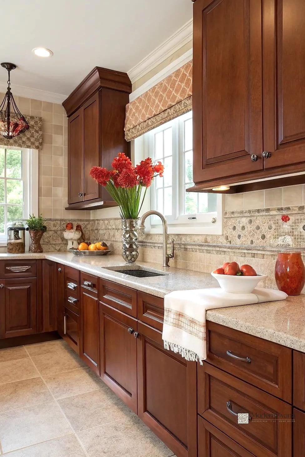
Extending the backsplash all the way to the upper cabinets, rather than stopping partway up the wall, creates a more finished, custom look. A neutral tile keeps the emphasis on the architecture rather than adding more color into the mix. This is a great option if you’re already renovating and want the kitchen to feel more cohesive top to bottom. It also protects more wall space from grease and splatters, which is a nice practical bonus.
Cottage-Style Beadboard Backsplash
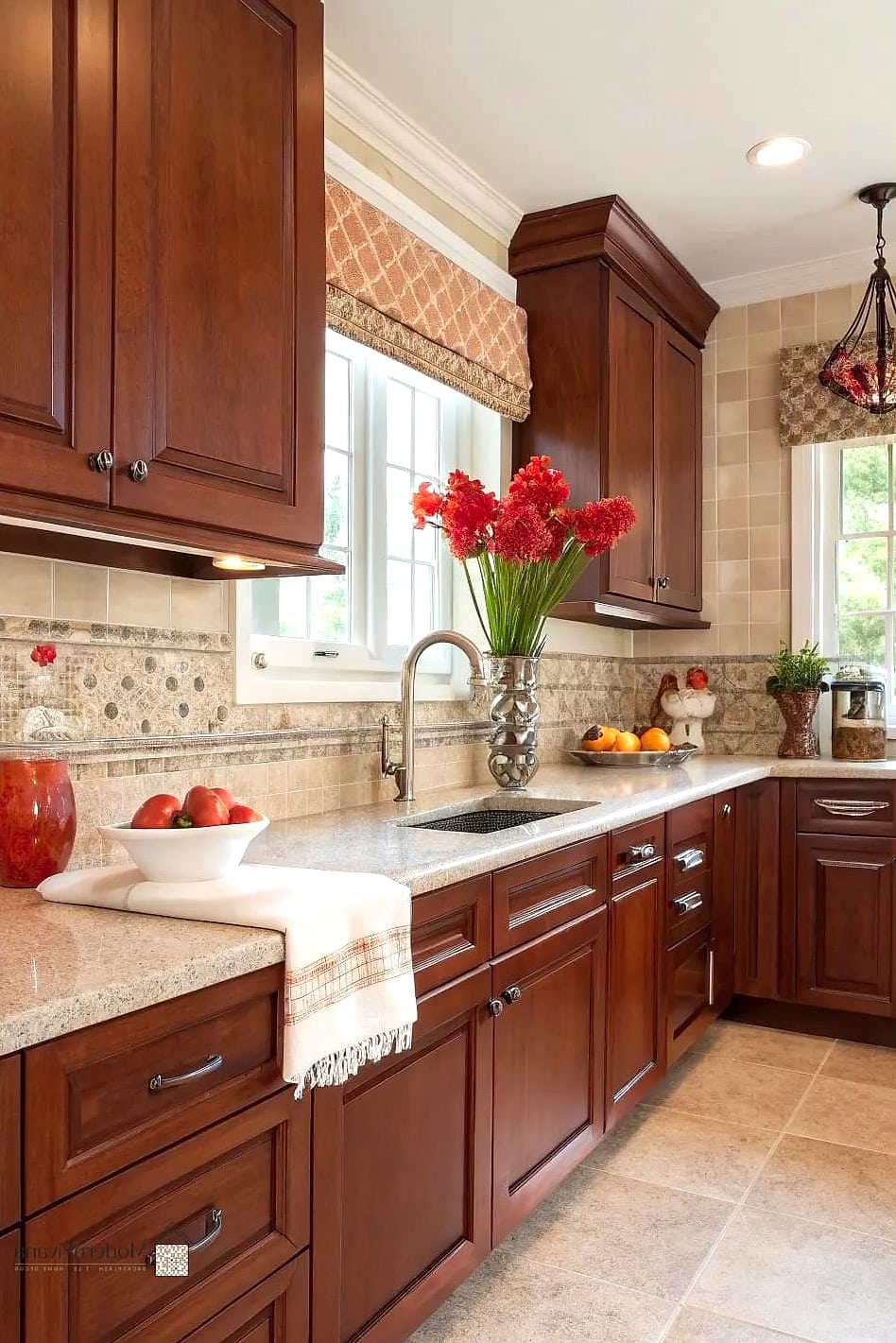
Beadboard painted in a soft white or cream brings a cottage feel that softens the formality cherry cabinets sometimes carry. It’s an unexpected material choice for a backsplash, but it works particularly well in farmhouse or cottage kitchens. This is also one of the more budget-friendly and DIY-friendly options on this list. Keep in mind it’s not as water-resistant as tile, so it works best away from the sink area.
Warm Taupe Subway Tile
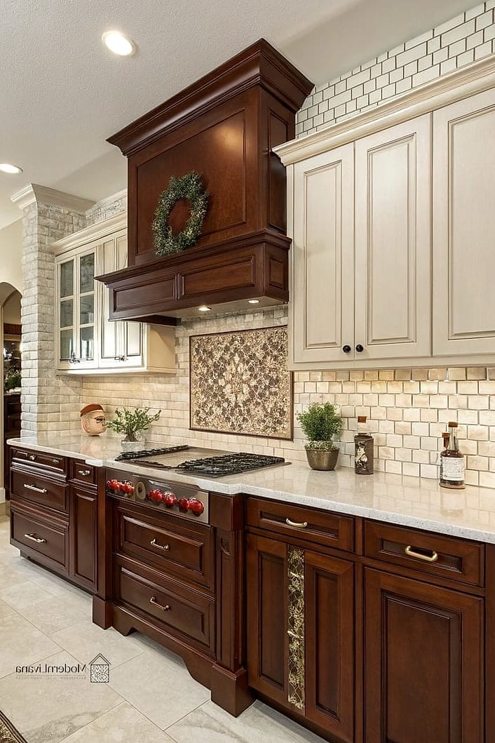
Taupe sits right between beige and gray, which makes it a flexible neutral that doesn’t clash with cherry’s warm undertones or cooler countertop materials. It’s a quiet, versatile choice for anyone who isn’t sure they want full contrast or full harmony with their cabinets. This tone also tends to photograph well, which matters if you’re planning to sell down the road. It’s a safe pick that still feels a little more considered than plain white.
Fish Scale Tile Pattern
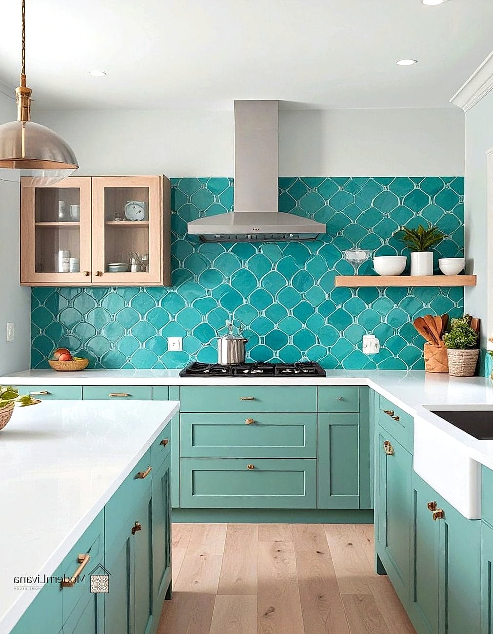
Fish scale, or scalloped tile, adds a playful, slightly whimsical shape that stands out from typical square or rectangular tile. In a soft cream or white, it keeps things classic while adding personality through shape alone. This works especially well as a focal point behind a range or in a small kitchen where you want one standout feature. It’s a bit more involved to install due to the curved edges, so budget a little extra for labor.
Two-Tone Tile Backsplash
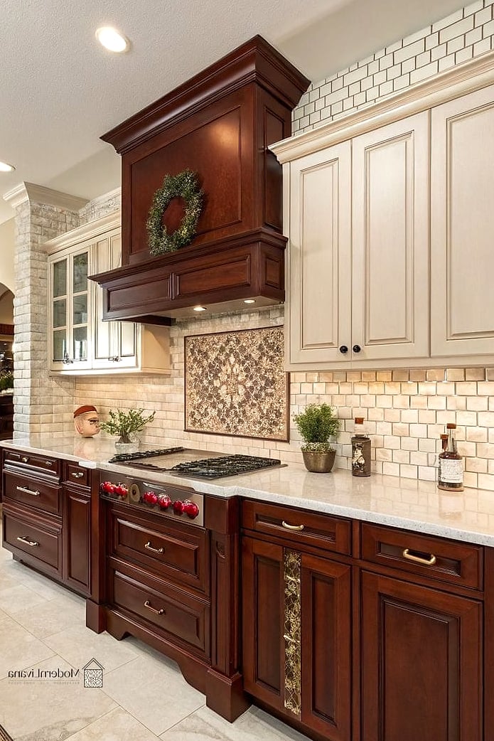
Combining two complementary tile colors, like a cream field tile with a deeper terracotta or rust accent strip, creates layered interest without overwhelming the kitchen. The accent color can echo the warmth in cherry cabinets while the neutral base keeps things balanced. This is a nice way to add a custom, designed feel without committing to an all-over pattern. It also gives you flexibility to update the accent later if your style shifts.
Rustic Reclaimed Brick Tile
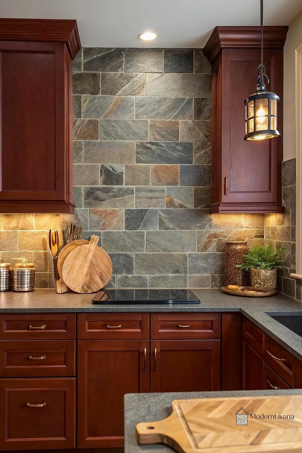
Thin brick tile, sometimes called brick veneer, brings texture and old-world charm that pairs surprisingly well with cherry cabinets in more rustic or industrial-leaning kitchens. The warm red and orange tones in the brick echo the wood without matching it exactly, which keeps things from feeling too on-the-nose. This is a striking choice for an accent wall behind open shelving or a range hood. It’s a heavier install, so make sure your walls can support it.
Soft Sage Green Tile
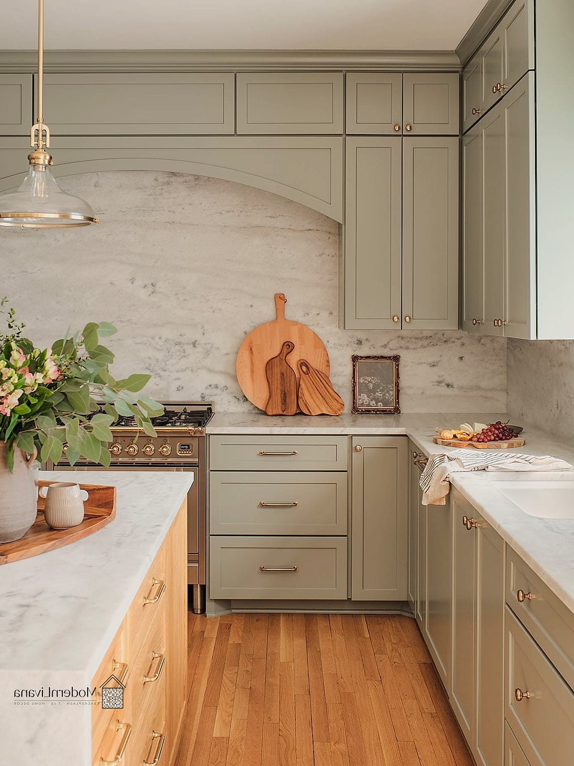
Sage green has become a favorite in kitchen design lately, and it happens to complement cherry cabinets nicely thanks to its muted, earthy quality. It’s calming without being boring, and it pairs well with brass, black, or nickel fixtures depending on the rest of your palette. This is a good option if you want a color that feels current but won’t look dated in five years. Ceramic tile in this shade is widely available at most price points.
Mixed Material Backsplash
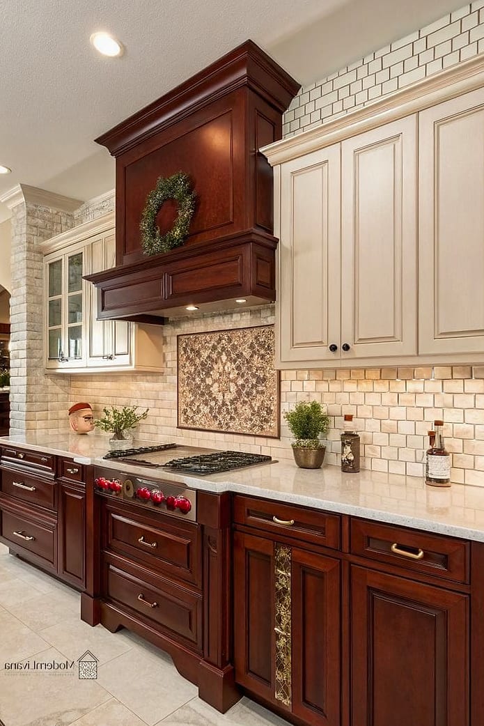
Combining two materials, like tile on the main wall and a stone or wood accent above the stove, gives the kitchen a layered, custom feel. This approach lets you balance warmth and contrast in a way a single material sometimes can’t. It’s a great option for kitchens undergoing a bigger renovation where budget allows for some experimentation. Just keep the color palette cohesive so the mix feels intentional rather than random.
Whatever direction you land on, the goal is really just balance. Cherry cabinets bring so much warmth and character on their own, and the right backsplash should support that instead of competing with it. Take a tile sample home, hold it up against your cabinets in different lighting, and trust your gut. At the end of the day, this is your kitchen, and it should feel like a space you actually enjoy standing in.