27 Two Tone Kitchen Ideas You Haven’t Seen Before
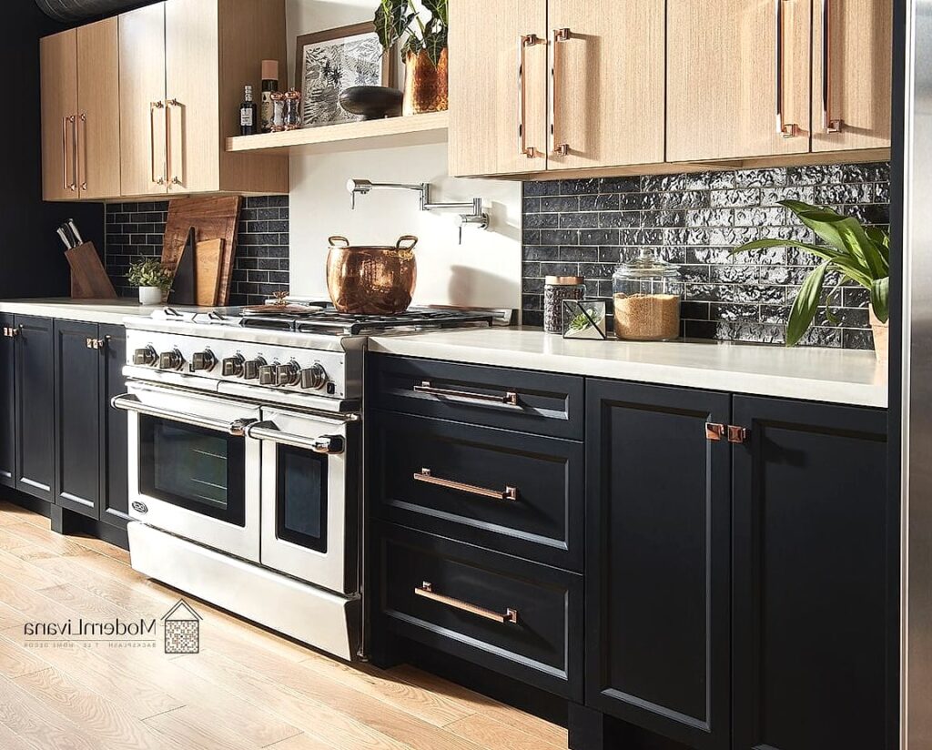
- Charcoal Lowers with Warm Oak Uppers
- Terracotta Island Against Sage Perimeter Cabinets
- Two Tone with a Wood Ceiling Beam Tie-In
- Matte Black Island with Creamy White Perimeter
- Color Blocked Cabinets on a Single Wall
- Two Tone with Different Cabinet Door Styles
- Blush and Walnut Combination
- Two Tone Peninsula Instead of an Island
- Navy Uppers, Light Wood Lowers (Reversed Formula)
- Two Tone with a Contrasting Toe Kick
- Olive Green and Black Combination
- Two Tone Open Shelving vs Closed Cabinets
- Sky Blue and White Beadboard Pairing
- Two Tone with Mixed Metal Hardware
- Deep Green Island with White Shaker Perimeter
- Two Tone Kitchen with a Painted Ceiling
- Rust and Cream Combination
- Two Tone Pantry Doors
- Charcoal and Brass with Marble Waterfall Island
- Two Tone with Different Countertop Materials
- Dusty Blue and Black Combination
- Two Tone with a Hidden Fridge Panel
- Cognac Leather-Look Cabinets with Cream
- Two Tone Kitchen Island Wrapped in Tile
- Warm Gray and Butter Yellow Combination
- Two Tone with Glass Front Uppers
- Espresso and Greige Combination
27 Two Tone Kitchen Ideas You Haven’t Seen Before
Two tone kitchens have been having a moment for a while now, but most of the inspiration out there is the same navy-and-white combo repeated a hundred different ways. If you’ve been scrolling for actual fresh ideas, you already know how repetitive it gets.
I’ve pulled together 27 two tone kitchen ideas that go beyond the obvious pairing. Some are bold, some are subtle, and a few might make you rethink what “two tone” even means. Let’s get into it.
Charcoal Lowers with Warm Oak Uppers
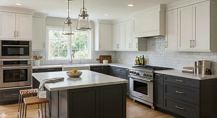
Instead of the usual dark-bottom-light-top formula with plain white, swap the white for warm oak upper cabinets. The contrast feels more organic and less stark than charcoal against white.
This combo works especially well in kitchens with lots of natural light, since the wood grain really gets to shine. It’s a favorite among homeowners who want something that reads modern but still feels cozy.
Terracotta Island Against Sage Perimeter Cabinets
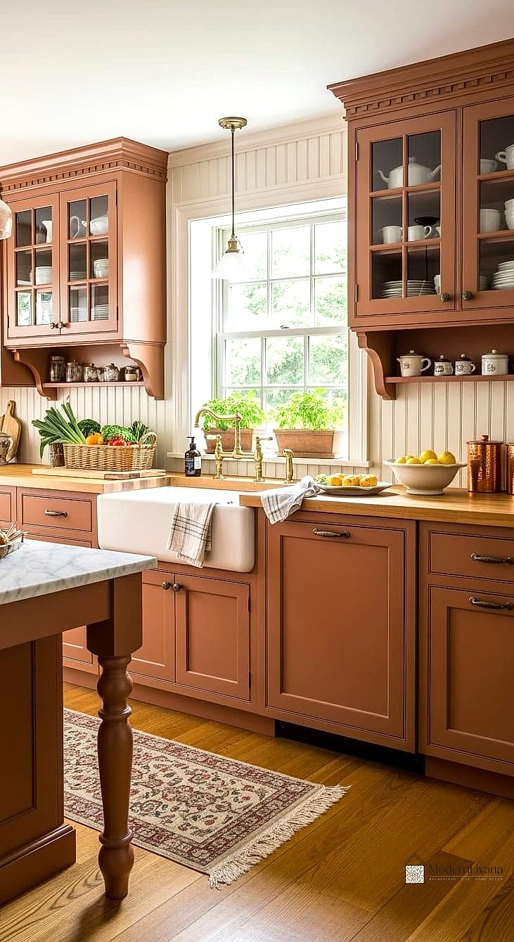
Terracotta is quietly becoming one of the more interesting accent colors in kitchen design, and pairing it with a soft sage green perimeter creates an earthy, almost Mediterranean feel.
This works best as an island-only application so the terracotta doesn’t overwhelm the space. Add brushed brass hardware and you’ve got a combination that feels curated rather than trendy.
Two Tone with a Wood Ceiling Beam Tie-In
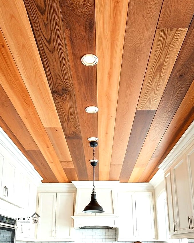
Rather than limiting the two tone effect to cabinetry, extend it upward. Pair dark lower cabinets with light upper cabinets, then add a stained wood ceiling beam that echoes the lower cabinet tone.
This creates a visual frame around the whole room. It’s a great option if your kitchen has exposed beams already or if you’re open to adding one as a design feature.
Matte Black Island with Creamy White Perimeter
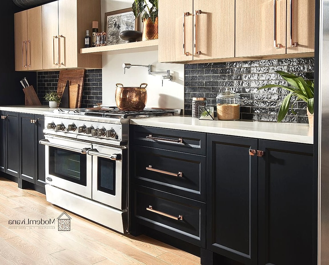
This one leans dramatic without going full moody kitchen. A matte black island surrounded by creamy (not stark white) perimeter cabinets gives you contrast without the harshness of true black and white.
Matte finishes hide fingerprints better than glossy black, which matters if you’ve got kids or a busy household touching that island all day.
Color Blocked Cabinets on a Single Wall
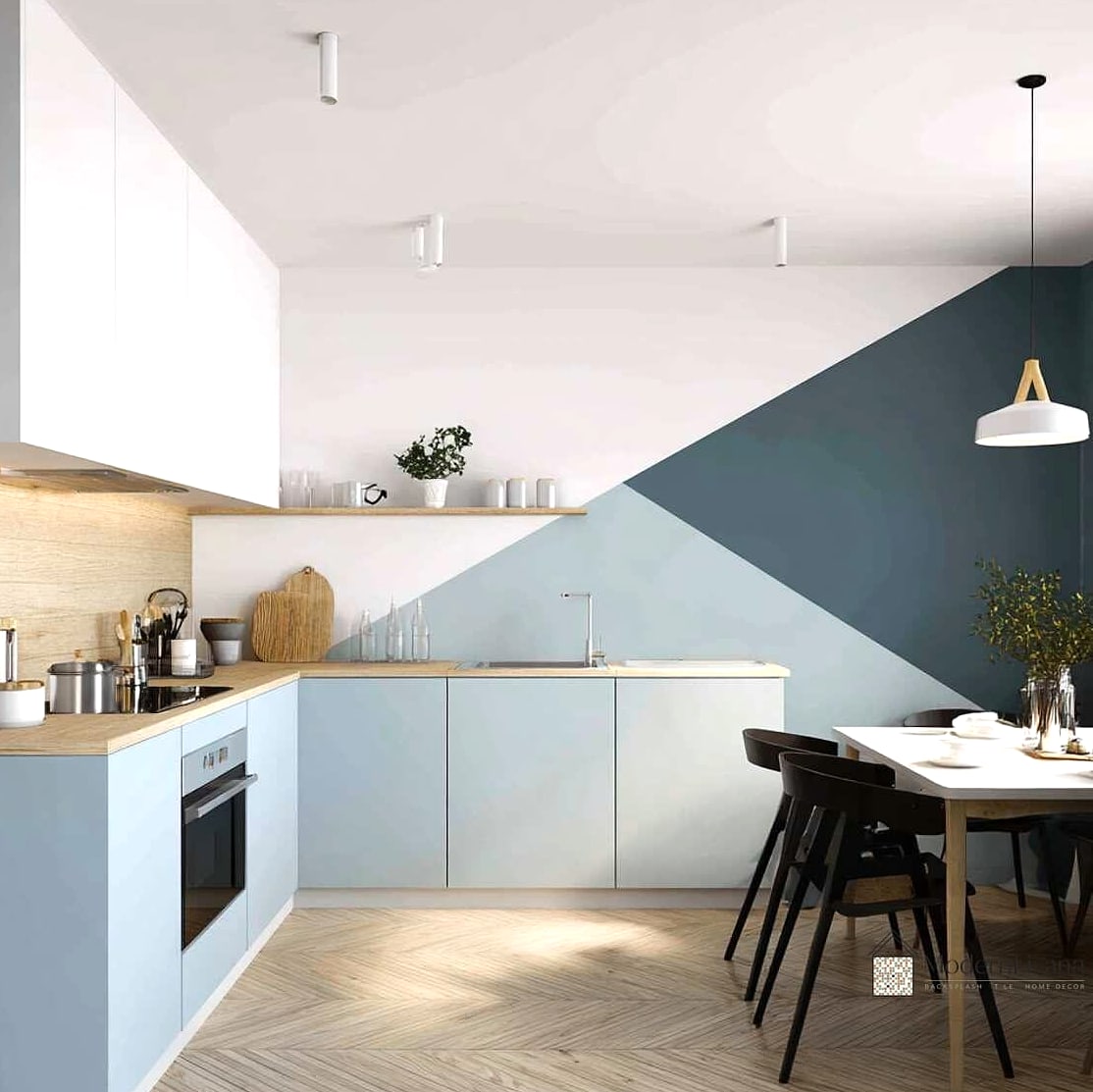
Instead of splitting upper and lower, try splitting left and right. One half of your cabinet wall in a deep color, the other half in a lighter neutral, meeting at a clean vertical line.
This is a fun one for galley kitchens or smaller spaces where you want visual interest without adding busy patterns.
Two Tone with Different Cabinet Door Styles
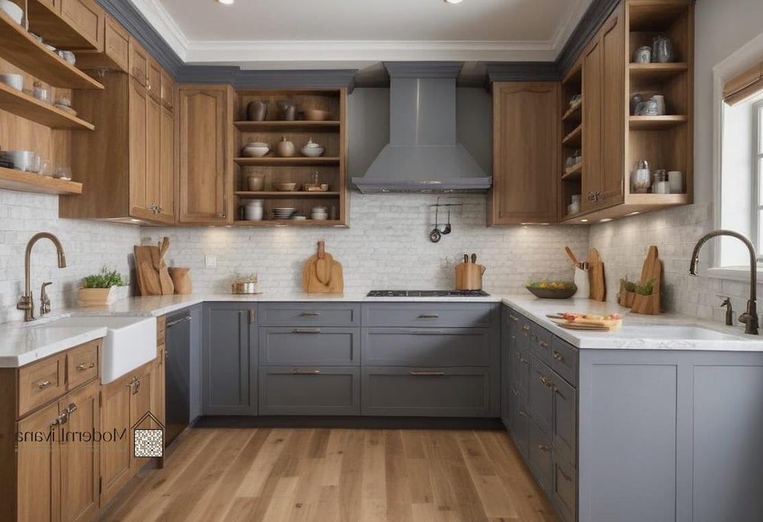
Most two tone kitchens keep the same door style throughout and just change color. Try mixing it up: shaker style lowers in a deep hue, flat-panel slab uppers in a lighter tone.
The combination of texture and color makes the kitchen feel more layered and intentional, almost like it was designed over time rather than all at once.
Blush and Walnut Combination
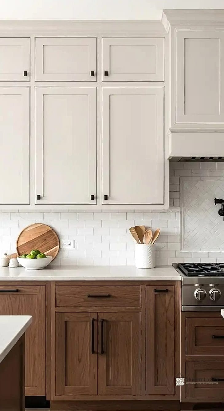
Blush pink sounds risky, but paired with rich walnut cabinetry, it reads sophisticated rather than sweet. Use blush on uppers or an island, and let walnut ground the space below.
This pairing works particularly well in kitchens with brass or gold fixtures, since warm metals bridge the two colors beautifully.
Two Tone Peninsula Instead of an Island
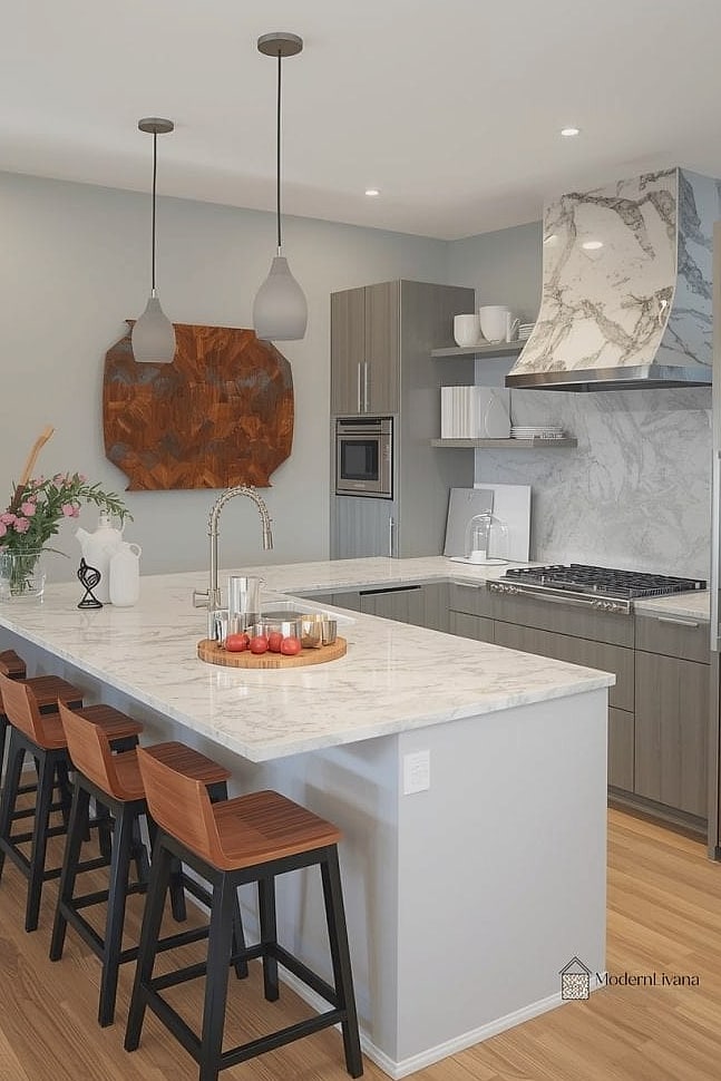
If you don’t have room for a full island, apply the two tone concept to a peninsula instead. Contrast the peninsula cabinetry against the rest of the kitchen for a similar visual punch in a smaller footprint.
This is a smart option for renters or smaller homes since a peninsula often requires less structural change than adding an island.
Navy Uppers, Light Wood Lowers (Reversed Formula)
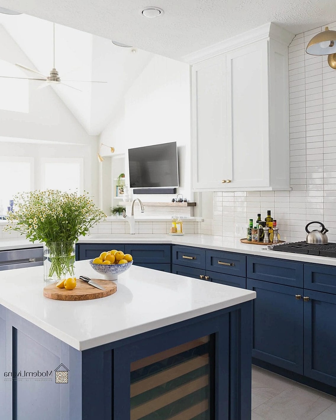
Everyone puts the dark color on the bottom. Flipping it, navy uppers with light wood lowers, creates a completely different visual weight. The room feels grounded and open at the same time.
This reversed approach also makes lower cabinets feel less bulky, which is helpful in kitchens where counter space feels tight.
Two Tone with a Contrasting Toe Kick
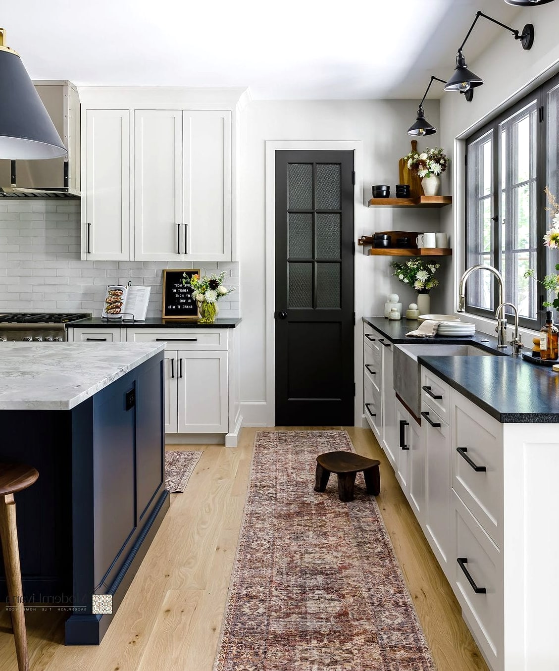
Here’s a subtle detail most people skip: painting or staining the toe kick a different color than the cabinets above it. A dark toe kick under white cabinets creates a “floating” effect.
It’s a low-cost update if you’re already refinishing cabinets, since it’s just one extra strip of trim to treat differently.
Olive Green and Black Combination
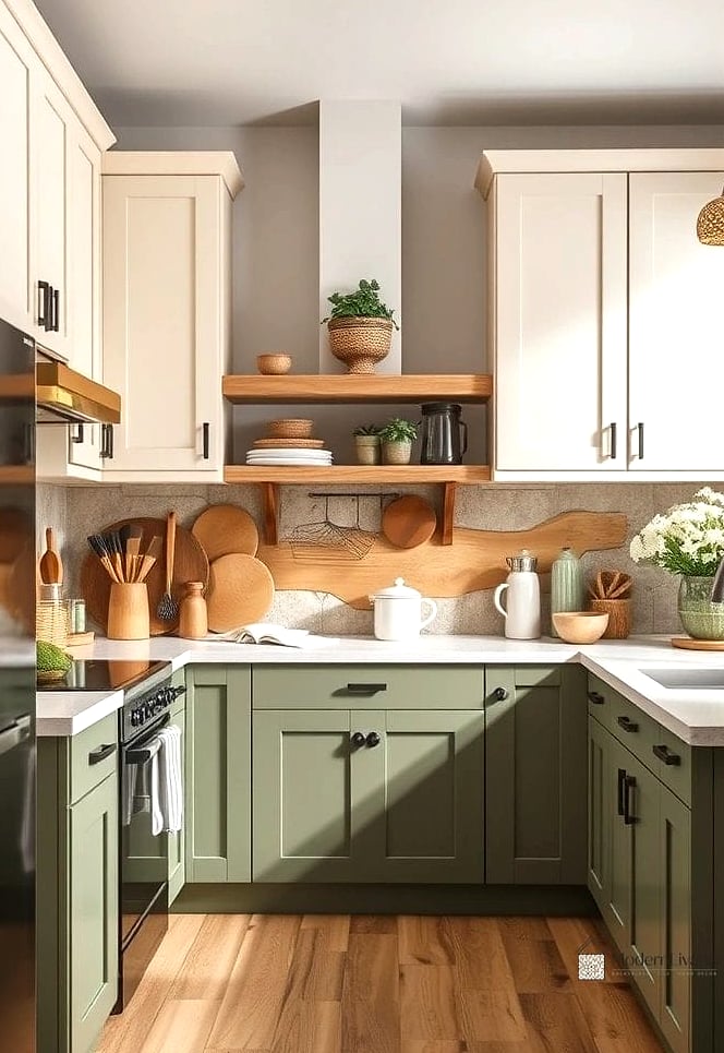
Olive green is having a real moment in kitchen design right now, and pairing it with black hardware or a black island creates a combination that feels current without being trendy in a way that’ll date quickly.
This pairing works in both traditional and modern kitchens, which makes it more versatile than a lot of trend colors.
Two Tone Open Shelving vs Closed Cabinets
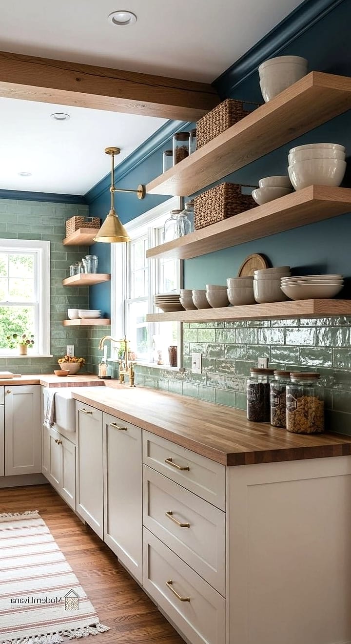
Instead of contrasting colors, contrast storage types. Keep upper cabinets as open shelving in a light wood tone, and lower cabinets closed and painted a deep color.
This gives you display space for pretty dishware up top while hiding the everyday clutter down below. It’s practical and visually interesting at once.
Sky Blue and White Beadboard Pairing
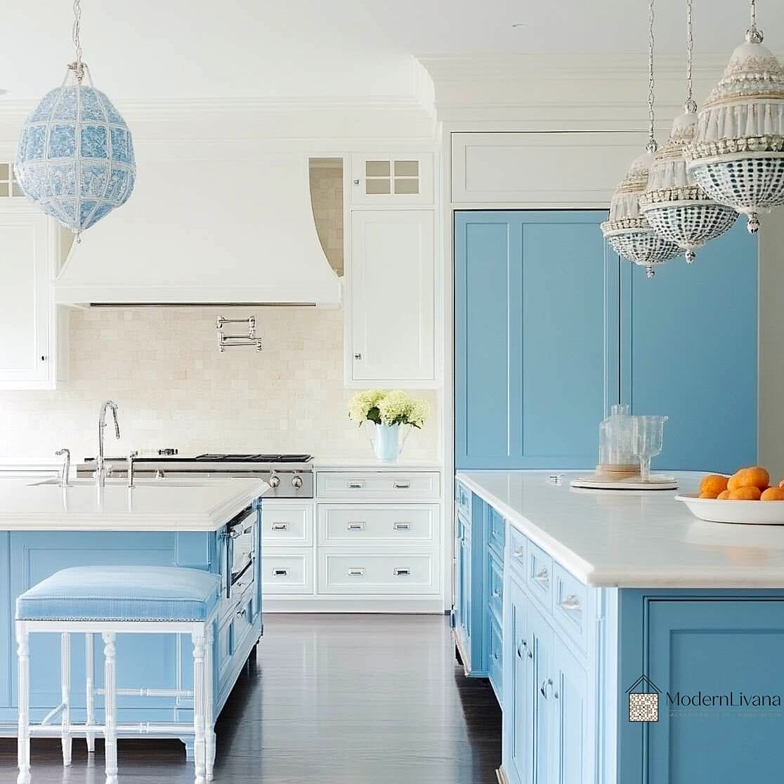
Beadboard lower cabinets in white paired with sky blue uppers give a cottage-meets-modern feel. This combination works beautifully in kitchens with vintage-inspired hardware and a farmhouse sink.
It’s also a fairly renter-friendly look if you use peel-and-stick beadboard wallpaper on cabinet fronts rather than committing to permanent millwork.
Two Tone with Mixed Metal Hardware
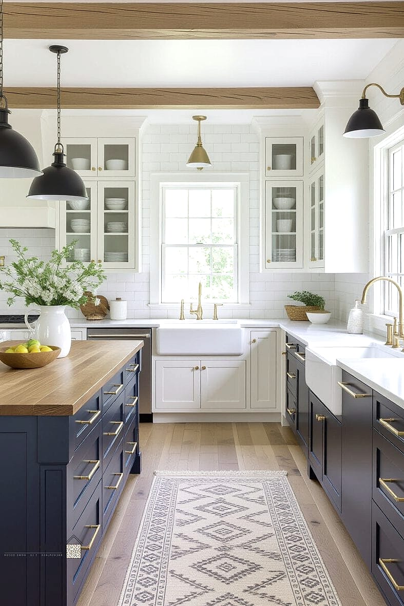
Rather than changing cabinet colors, some designers are getting the two tone effect through hardware alone: brushed brass pulls on upper cabinets, matte black pulls on lower cabinets, same cabinet color throughout.
This is one of the easiest and most budget-friendly ways to test the two tone look before committing to paint.
Deep Green Island with White Shaker Perimeter

A classic combination, but with a twist: instead of navy, go for a deep forest or hunter green island. It reads a little more unexpected than navy while still feeling timeless.
Pair with brass fixtures and butcher block counters on the island specifically for a warm, layered look.
Two Tone Kitchen with a Painted Ceiling
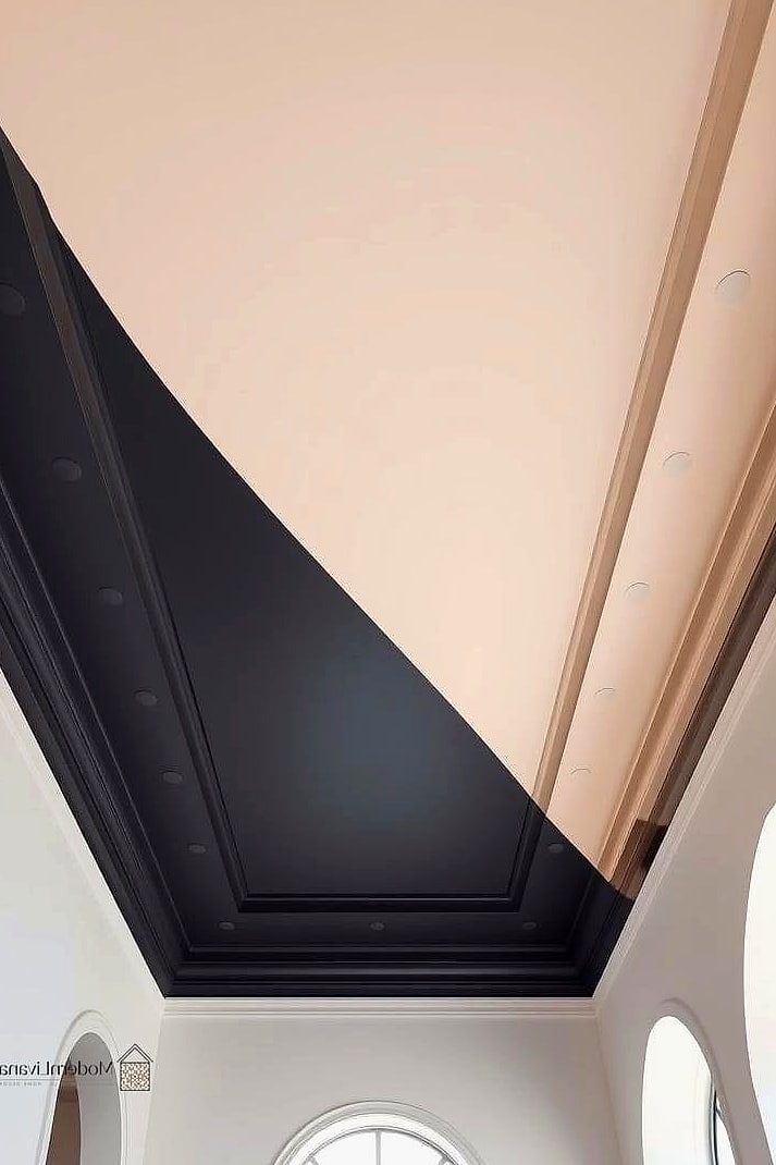
Extend your accent color onto the ceiling instead of just the cabinets. If your lower cabinets are a deep color, painting the ceiling that same shade creates a cocooning, intentional effect that ties the whole room together.
This works especially well in kitchens with lower ceilings, where it can actually make the space feel more dramatic rather than smaller.
Rust and Cream Combination
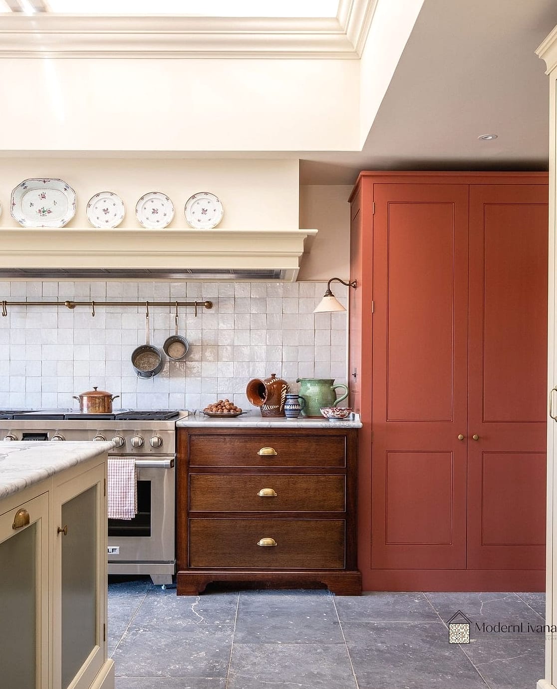
Rust orange lower cabinets against cream uppers give you warmth without leaning too rustic or too modern. It sits in a nice in-between zone that works with a lot of different overall home styles.
This pairing photographs beautifully in natural light, which is part of why it’s been popping up more in kitchen renovations lately.
Two Tone Pantry Doors
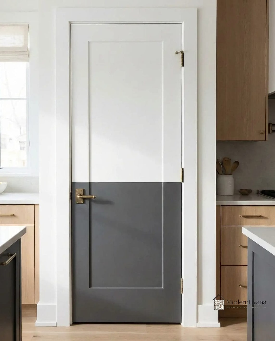
If you have a walk-in pantry or pantry cabinet, treat its doors as a separate design opportunity. Paint them a contrasting color from the rest of the kitchen for a fun surprise element.
This is a low-commitment way to experiment with a bold color since it’s contained to a smaller area.
Charcoal and Brass with Marble Waterfall Island
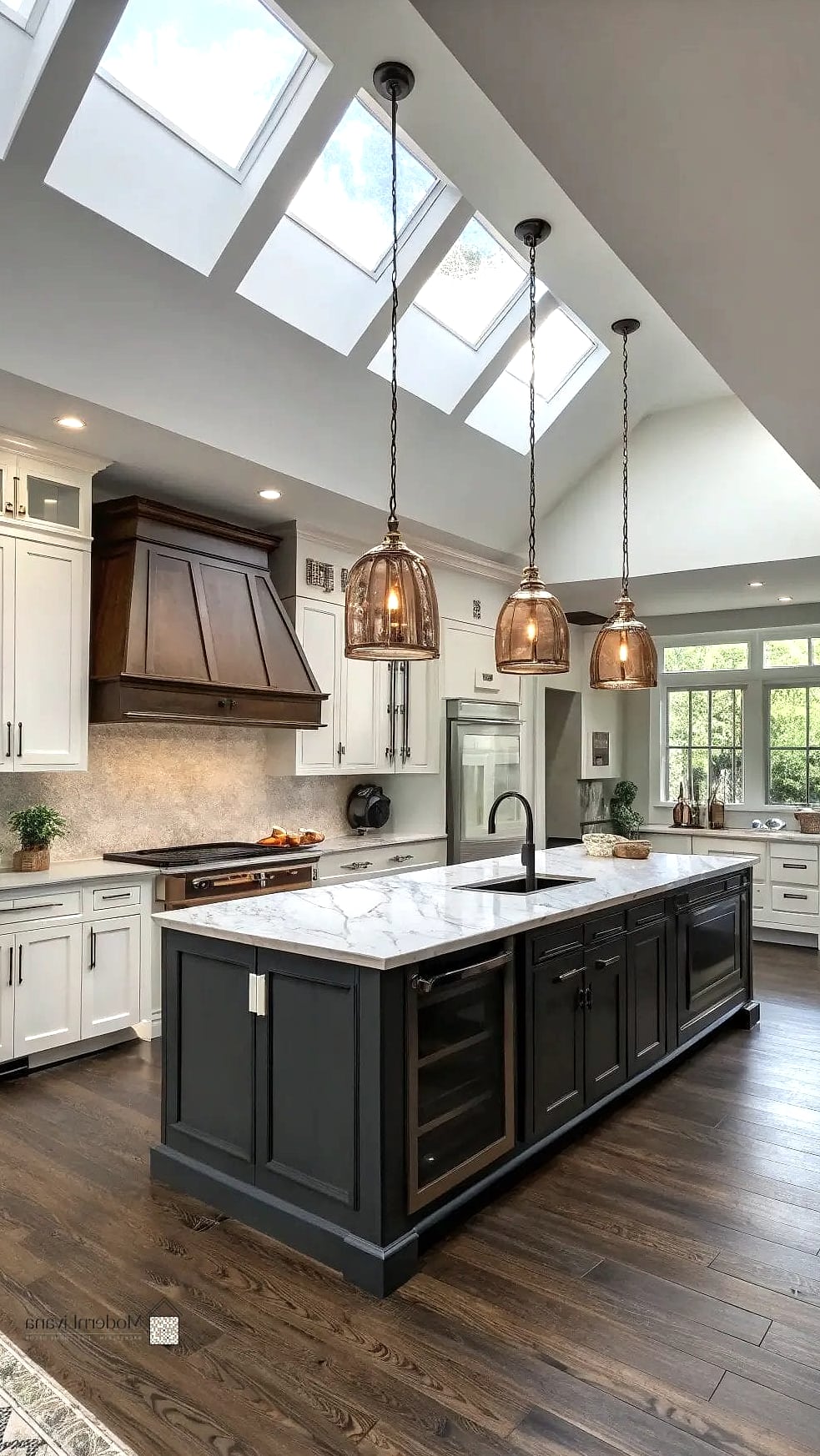
Pair charcoal lower cabinetry with white or cream uppers, then add a marble waterfall edge island in between. The island essentially becomes its own third tone, adding texture and luxury to the two tone base.
This is more of a splurge option, but it delivers serious visual impact for kitchens aiming for a high-end look.
Two Tone with Different Countertop Materials

Instead of matching countertops throughout, use butcher block on the lighter cabinets and quartz or stone on the darker ones. The material shift reinforces the color contrast and adds practical variety too.
Butcher block is great near prep areas, while stone counters near the sink or stove handle moisture and heat better.
Dusty Blue and Black Combination
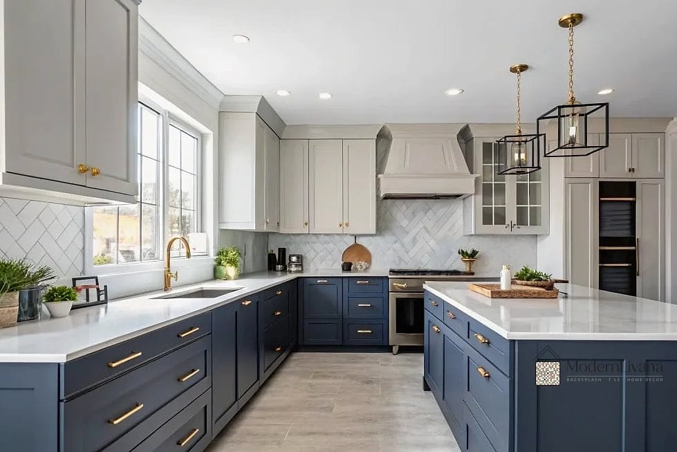
Dusty blue is softer and more muted than navy, and pairing it with black accents (hardware, faucet, light fixtures) keeps it from feeling too pastel or precious.
This combination tends to suit both modern farmhouse and transitional style kitchens, so it’s flexible depending on the rest of your home.
Two Tone with a Hidden Fridge Panel
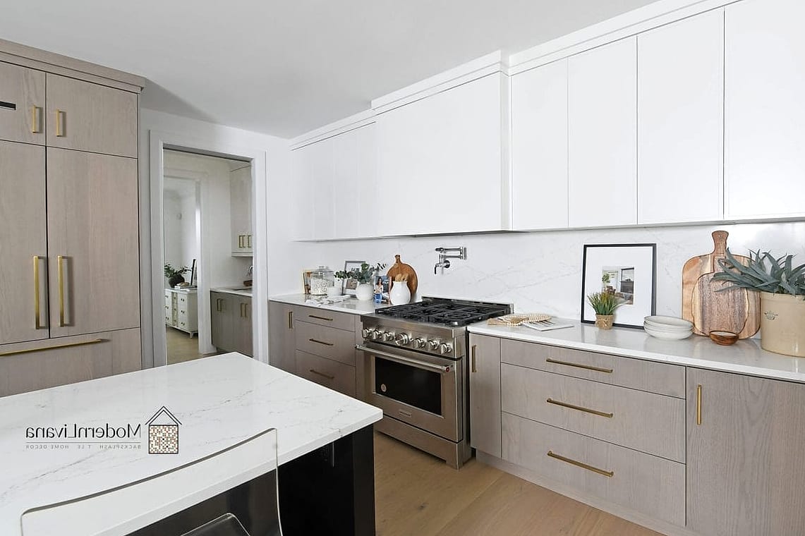
Match your fridge panel to your upper cabinets while lower cabinets stay a contrasting color. The fridge essentially disappears into the design instead of standing out as an appliance.
This is a more custom, higher-budget option, but it makes a huge difference in how cohesive the kitchen feels overall.
Cognac Leather-Look Cabinets with Cream

Cognac or caramel-toned cabinets, especially ones with a leather-look or textured finish, paired with cream uppers give a rich, almost hospitality-inspired feel.
This combination leans luxurious but works in a family kitchen too, especially with durable matte finishes that hold up to daily wear.
Two Tone Kitchen Island Wrapped in Tile
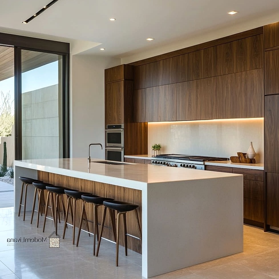
Instead of paint, wrap your island base in tile, maybe a bold color or pattern, while keeping the perimeter cabinets a simple neutral. The tile texture does the contrasting work instead of color alone.
Zellige or ceramic tile both work well here and add a handmade, artisan quality to the space.
Warm Gray and Butter Yellow Combination

Butter yellow has been showing up more in kitchens lately, and pairing it with warm gray keeps it from feeling too saccharine. Use yellow on an island or accent wall of cabinets, gray everywhere else.
This combination feels cheerful without being overwhelming, and it photographs really well against white oak flooring.
Two Tone with Glass Front Uppers

Add glass fronts to your upper cabinets in a light color while keeping lowers solid and dark. The glass breaks up the visual weight of the upper cabinets and lets you style what’s inside as part of the overall look.
This works particularly well if you have nice dishware or glassware you actually want on display rather than hidden away.
Espresso and Greige Combination
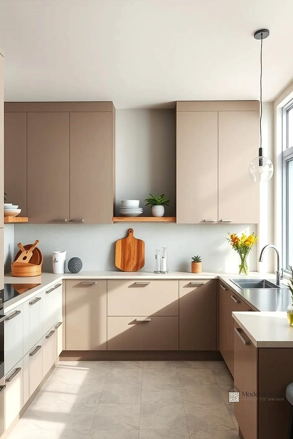
Espresso brown lower cabinets with greige (that gray-beige in-between color) uppers create a combination that’s warm, grounded, and genuinely hard to date. It sits comfortably between trendy and traditional.
This is a solid choice if you want a two tone kitchen that’ll still look good in ten years, not just this season.
Final thoughts: the best two tone kitchen ideas aren’t always about picking the boldest color pairing you can find. Sometimes it’s a material contrast, a hardware swap, or an unexpected placement that makes the difference. Whichever direction you go, start small if you’re unsure, a pantry door, an island, or even just hardware, before committing to a full cabinet overhaul.