14 Minimalist Kitchen Ideas You Haven’t Seen Before
- Monochrome Cabinets in an Unexpected Color
- A Single Statement Material Instead of Multiple Finishes
- Push-to-Open Cabinets With Zero Visible Hardware
- A Hidden Pantry Behind a Flush Door
- Warm Wood Ceiling Instead of Wood Cabinets
- Countertop-Height Backsplash Only
- Open Shelving With Only Three or Four Objects Per Shelf
- A Single Pendant Light Instead of a Row of Them
- Integrated Appliances Behind Cabinet-Matched Panels
- A Built-In Coffee or Beverage Station Behind Closed Doors
- Terrazzo Flooring in Soft, Muted Tones
- A Curved Island Instead of a Rectangular One
- Concealed Range Hood Inside the Cabinetry
- A Single Tone-on-Tone Pattern on the Floor
14 Minimalist Kitchen Ideas You Haven’t Seen Before
Minimalist kitchens get a bad reputation for feeling cold or sterile, but that’s really only true when they’re done wrong. A good minimalist kitchen should feel calm, functional, and a little bit luxurious without trying too hard. It’s less about having nothing and more about having only what earns its place.
If you’ve scrolled through the same all-white, handle-less cabinet photos a hundred times, this list skips that territory entirely. These are fresher takes on minimalist kitchen design that still keep things simple, uncluttered, and easy to live with every day.
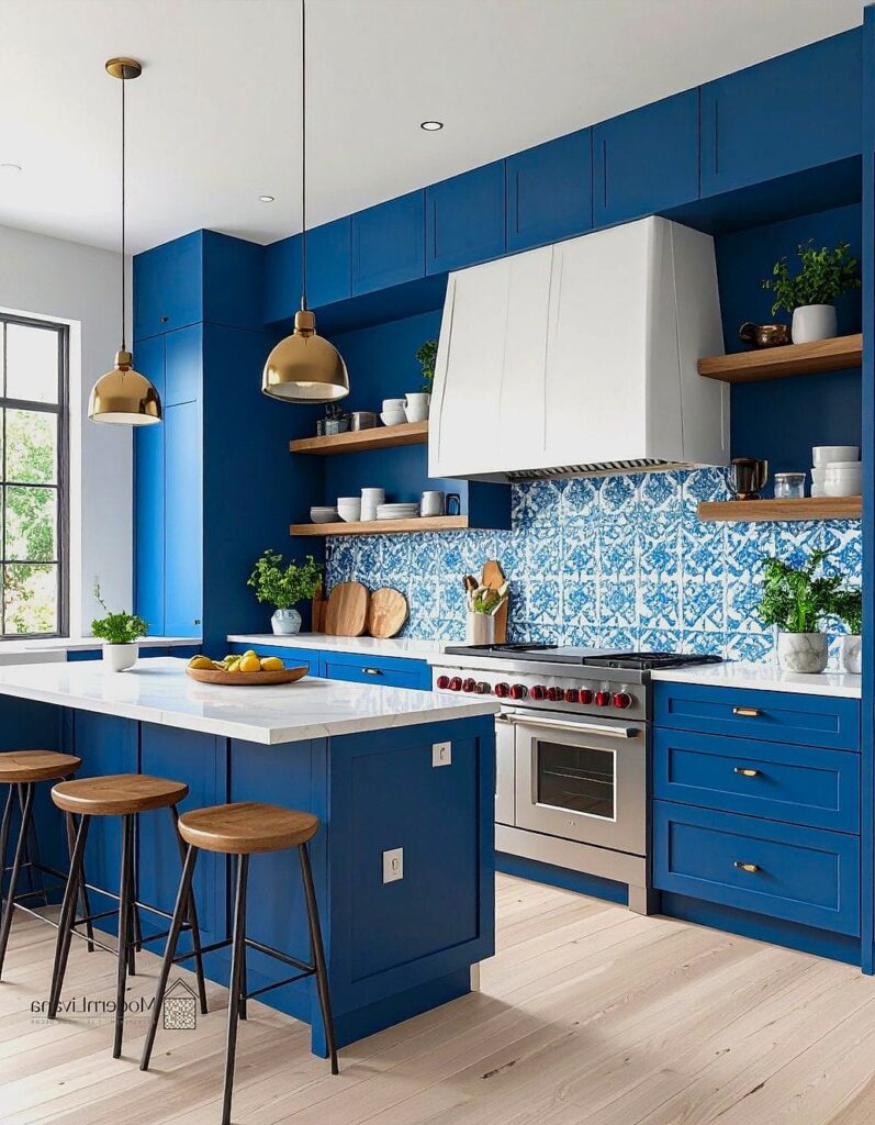
Monochrome Cabinets in an Unexpected Color
Everyone assumes minimalist means white or gray, but a single saturated color across all your cabinetry can feel just as clean. Think deep olive, warm terracotta, or a muted clay tone from top to bottom.
This works especially well in smaller kitchens where you want cohesion without visual noise. Because there’s only one color doing the talking, the eye doesn’t have anything to trip over. Pair it with matching or barely-there hardware so the color reads as one continuous surface rather than a bunch of separate boxes.
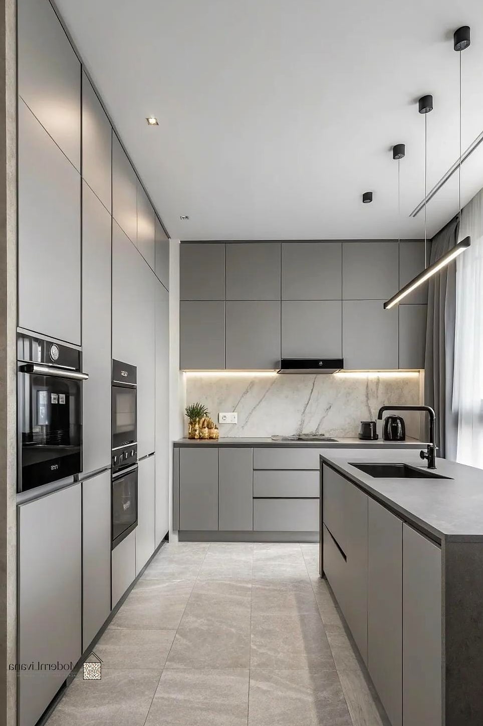
A Single Statement Material Instead of Multiple Finishes
Minimalist kitchens often go wrong by mixing too many textures trying to look “curated.” Instead, pick one material and let it carry the whole room. A slab of honed marble that runs from the countertop up the backsplash, for example, does more visual work than five different finishes combined.
This is a great option if you’re leaning toward a slightly luxury feel without adding clutter. It’s pricier upfront, but porcelain slab alternatives now mimic the look at a fraction of the cost and stains less easily, which matters if you cook often.
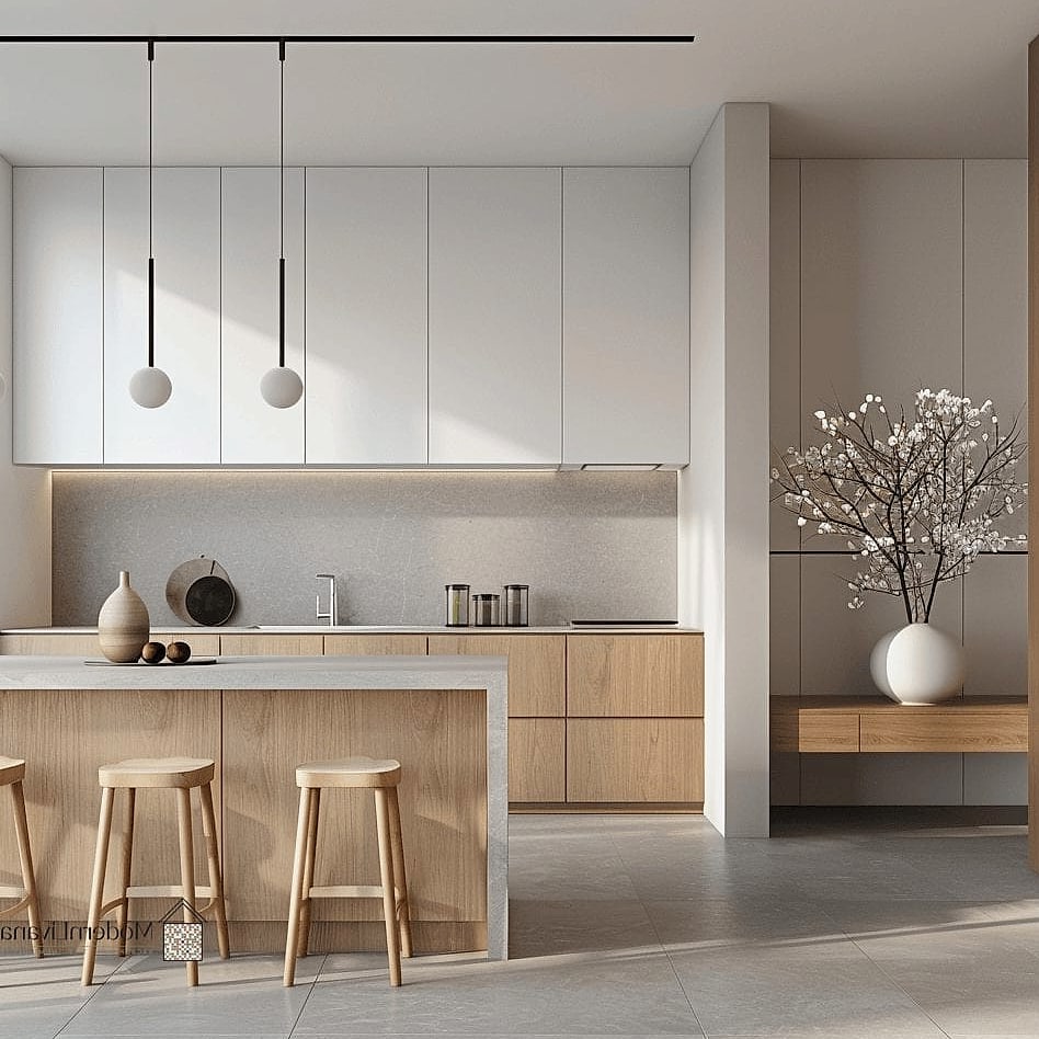
Push-to-Open Cabinets With Zero Visible Hardware
Handle-less cabinets aren’t new, but most people still default to visible pulls out of habit. Push-to-open mechanisms let every surface stay completely flat, which is what actually makes a kitchen look minimalist rather than just “handle-free in theory.”
It’s a small mechanical upgrade, but it changes how the whole kitchen reads from across the room. Just know that push-latch hardware needs a firmer touch and isn’t always the best fit for households with small kids who like to lean on everything.
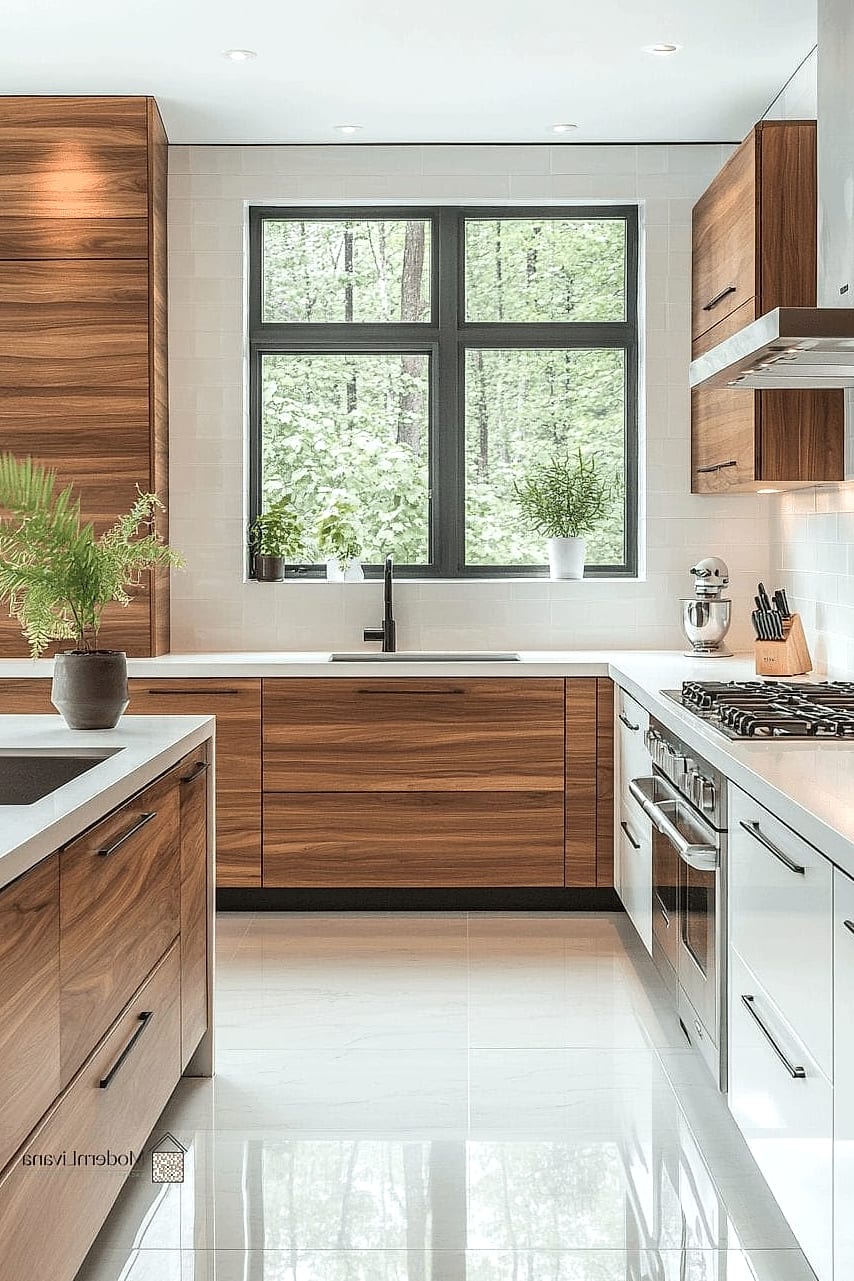
A Hidden Pantry Behind a Flush Door
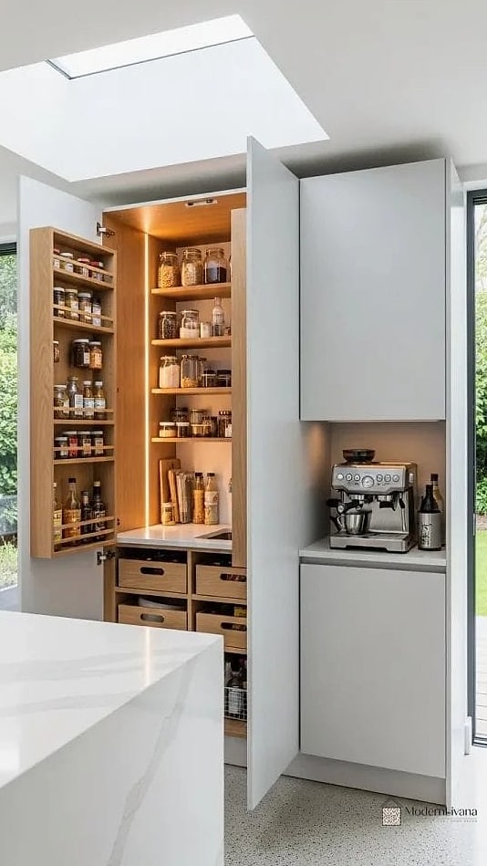
One of the most underrated minimalist moves is tucking your pantry behind a door that matches the surrounding wall or cabinetry exactly. From the outside, it just looks like another panel. Open it up, and there’s a fully stocked, organized pantry system waiting behind it.
This works especially well in open-concept layouts where the kitchen is visible from the living or dining space. Add drawer organizers and labeled bins inside so the hidden space stays as tidy as the one people actually see.
Warm Wood Ceiling Instead of Wood Cabinets
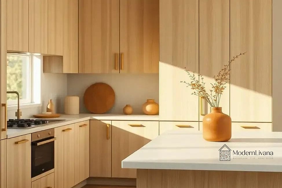
Wood accents in minimalist kitchens usually show up on cabinets or open shelving. Flip that idea and put the wood on the ceiling instead, using slatted wood panels or a simple tongue-and-groove finish, while keeping the cabinetry a flat matte white or stone gray.
It draws the eye upward and adds warmth to a room that could otherwise feel a little flat. This is also a nice option if you’re renting and can’t touch the cabinets, since ceiling treatments are sometimes easier to negotiate or reverse.
Countertop-Height Backsplash Only
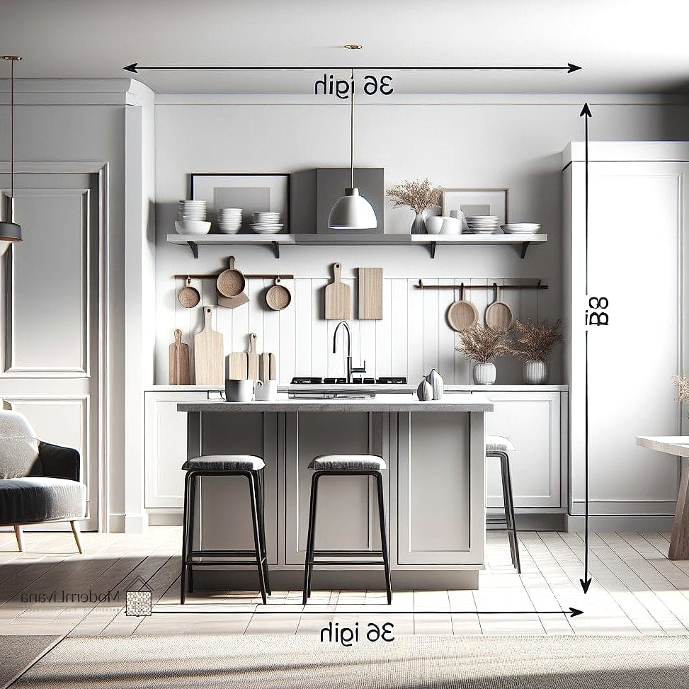
Instead of running tile all the way up to the cabinets, stop it at just four or five inches. This creates a clean strip of protection where splashes actually happen, while letting the wall color or plaster finish take over above it.
It’s a subtle change, but it keeps the eye moving in a straight, uninterrupted line, which is really the whole point of minimalist design. It’s also more budget-friendly since you’re using far less tile, and it’s a manageable weekend DIY project if you’ve never tiled before.
Open Shelving With Only Three or Four Objects Per Shelf
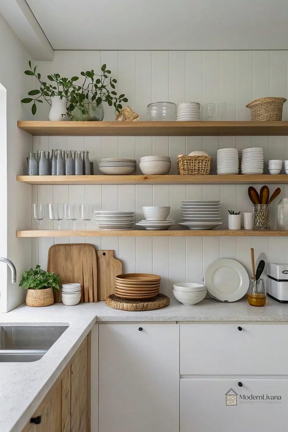
Open shelving gets a bad rap in minimalist spaces because people tend to overfill it. The trick nobody talks about is treating each shelf like a tiny still life; a stack of bowls, one plant, maybe a single ceramic pitcher, and nothing else.
This restraint is what separates a minimalist shelf from a cluttered one. Floating shelves in a matching wood tone to your countertop tie the look together without adding another material into the mix.
A Single Pendant Light Instead of a Row of Them
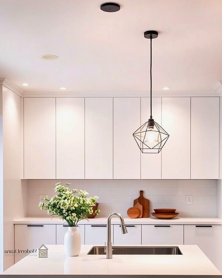
Multiple pendant lights over an island have been the default for years, but one oversized pendant, centered and slightly larger than expected, reads as far more intentional and minimalist. It becomes a quiet focal point instead of a repeated pattern.
Go with a matte black, brushed brass, or unglazed ceramic fixture depending on your palette. Just make sure it’s sized correctly for the island; too small and it looks like an afterthought, too large and it starts competing with everything else.
Integrated Appliances Behind Cabinet-Matched Panels
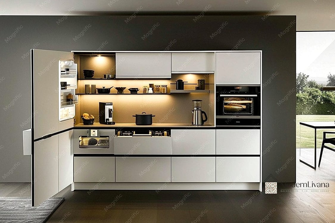
Refrigerators and dishwashers with visible stainless steel fronts can undo a lot of minimalist effort in one glance. Panel-ready appliances let you cover them with cabinetry fronts that match the rest of the kitchen exactly, so the whole wall reads as one continuous surface.
It’s a bigger investment, but the payoff is a kitchen that looks less like a showroom and more like a calm, cohesive room. If a full panel-ready fridge isn’t in the budget, even matching the dishwasher panel alone makes a noticeable difference.
A Built-In Coffee or Beverage Station Behind Closed Doors
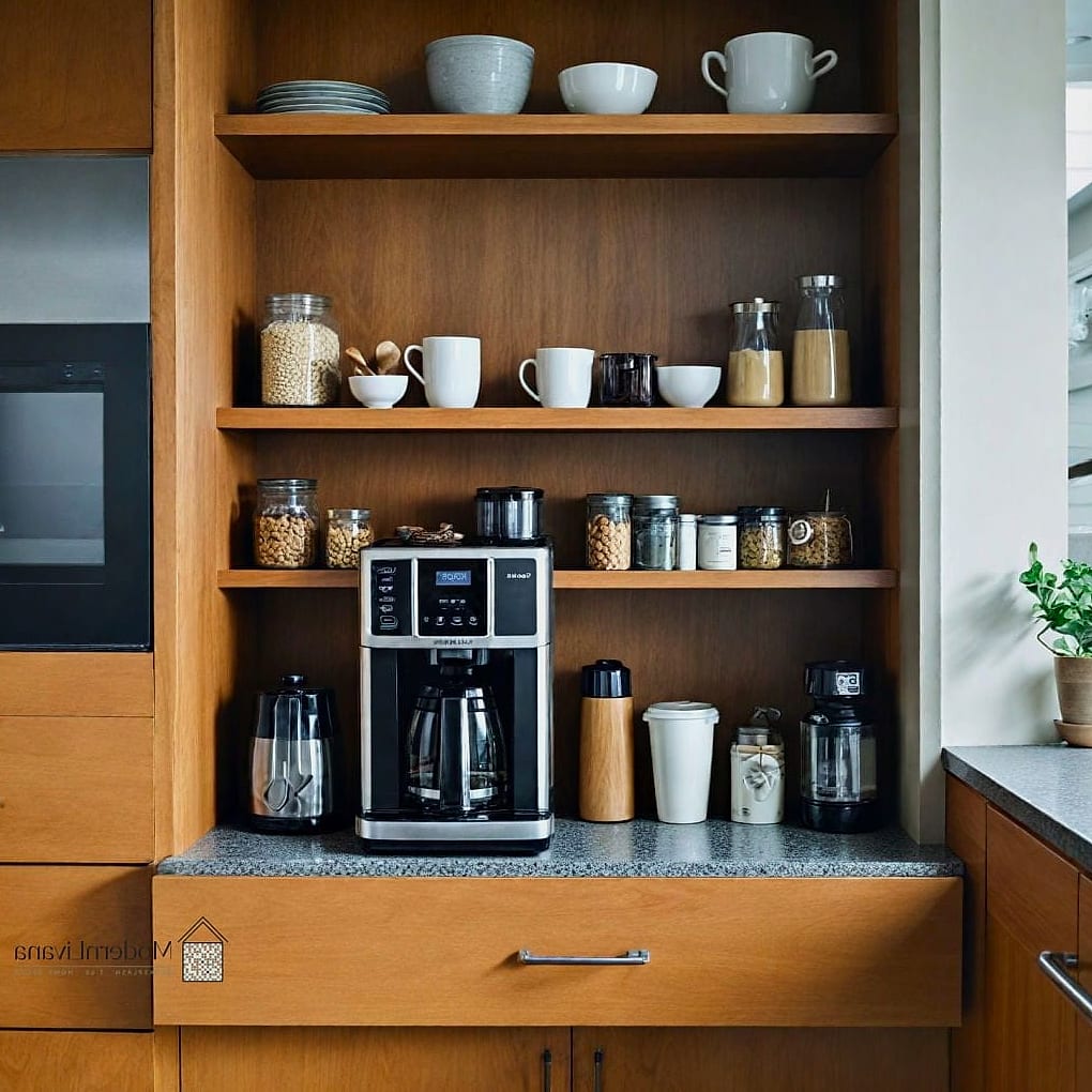
Countertop clutter is the number one thing that kills a minimalist look, and coffee makers, mugs, and syrups are usually the worst offenders. Carving out a dedicated nook behind cabinet doors, complete with an outlet inside, keeps all of that gear out of sight until it’s needed.
This is especially handy for families or anyone who has more coffee equipment than they’d like to admit. Add a pull-out shelf inside so you can still use the appliances without dragging them out onto the main counter.
Terrazzo Flooring in Soft, Muted Tones
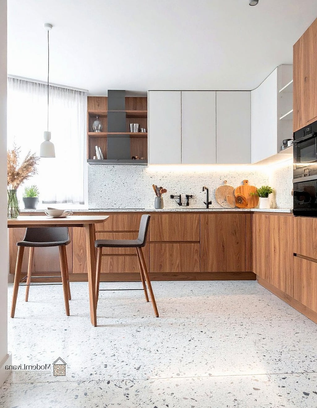
Terrazzo has made a comeback, but most people picture the bold, colorful chip patterns from decades past. A modern, minimalist terrazzo with soft gray or cream chips in a neutral base reads completely differently, almost like a quiet, textured stone.
It’s incredibly durable and hides everyday wear well, which makes it practical for busy households and pet owners alike. Porcelain tile versions are widely available now too, so you can get the look without the cost or maintenance of true poured terrazzo.
A Curved Island Instead of a Rectangular One
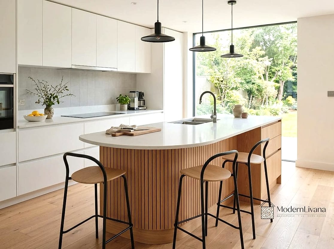
Sharp, boxy islands are the minimalist default, but a softly curved or rounded island edge feels just as clean while adding a bit of visual interest. The curve also tends to improve traffic flow, especially in kitchens where people naturally cut a corner anyway.
This works well in both small and large kitchens, though it typically requires custom cabinetry work, so it leans more toward the higher end of the budget spectrum. The payoff is a shape nobody else on the block has.
Concealed Range Hood Inside the Cabinetry
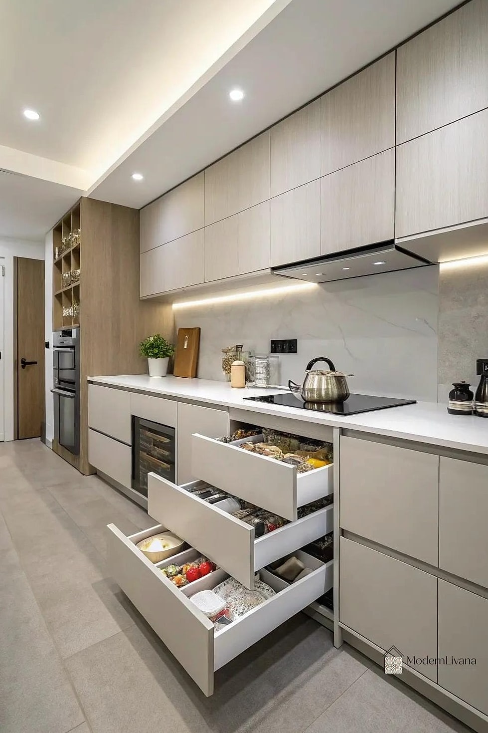
Range hoods often become the loudest visual element in a kitchen without anyone intending them to. Hiding the hood mechanism inside a custom wood or matching cabinetry box keeps the ventilation system fully functional while removing that stainless steel focal point entirely.
It’s a smart move for anyone who wants their eye to land on the room as a whole rather than one appliance. This usually requires working with a cabinet maker or contractor familiar with venting requirements, so it’s less of a DIY weekend project and more of a renovation-phase decision.
A Single Tone-on-Tone Pattern on the Floor
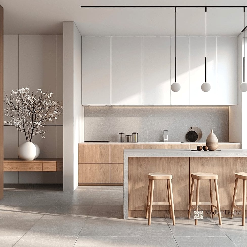
Patterned floors and minimalism don’t usually get mentioned in the same sentence, but a subtle tone-on-tone pattern, like a matte and glossy version of the same tile color, adds texture without adding visual clutter. From a distance, it reads as a solid floor. Up close, there’s clearly more going on.
This is a nice middle ground for anyone who finds truly plain flooring a little boring but still wants the room to feel calm overall. Large-format tile in a herringbone layout using this technique keeps grout lines minimal, which also cuts down on cleaning time.
Final Thoughts
Minimalist kitchens don’t have to look like everyone else’s Pinterest board. The ideas that actually stand out usually come from small, intentional choices rather than following the same handle-less, all-white formula over and over.
Pick one or two of these that fit your space and budget rather than trying to do all of them at once. A minimalist kitchen works best when it feels edited, not empty, and these fresher takes on “14 Minimalist Kitchen Ideas You Haven’t Seen Before” should give you plenty to work with, whether you’re planning a full renovation or just rethinking a few details.